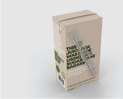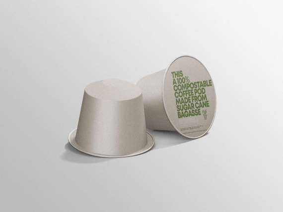
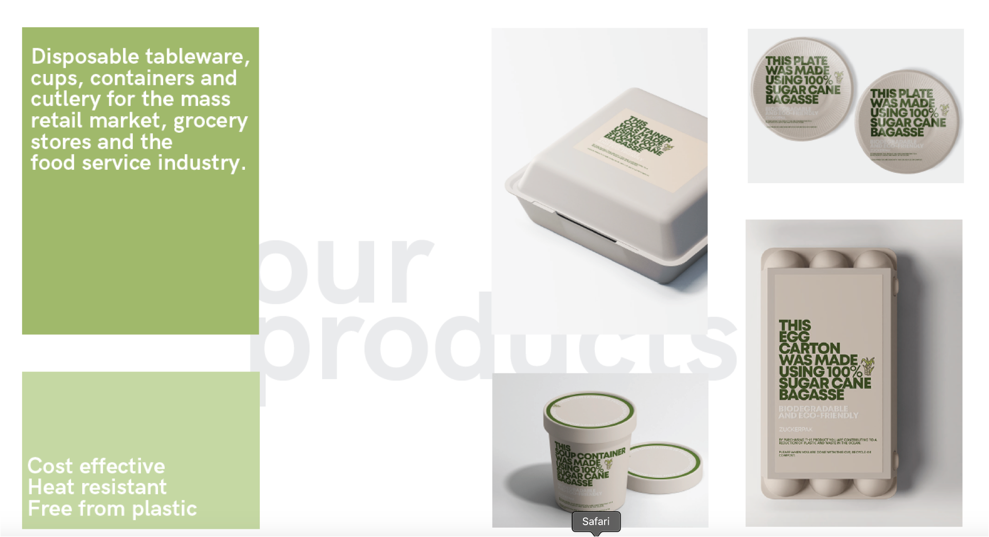
Packaging is the first thing people touch.
It should say what it is made of.
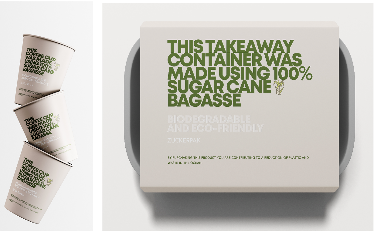
Sugar cane leftovers, not plastic.
The type does the talking.
Color guides the buying decision.
One color, one message, no noise.
Every bag, box and cup works as a set.
Design and function work together.
Honest material, honest design.
Good packaging disappears after use.
This one actually does.
Suistaintability is in.

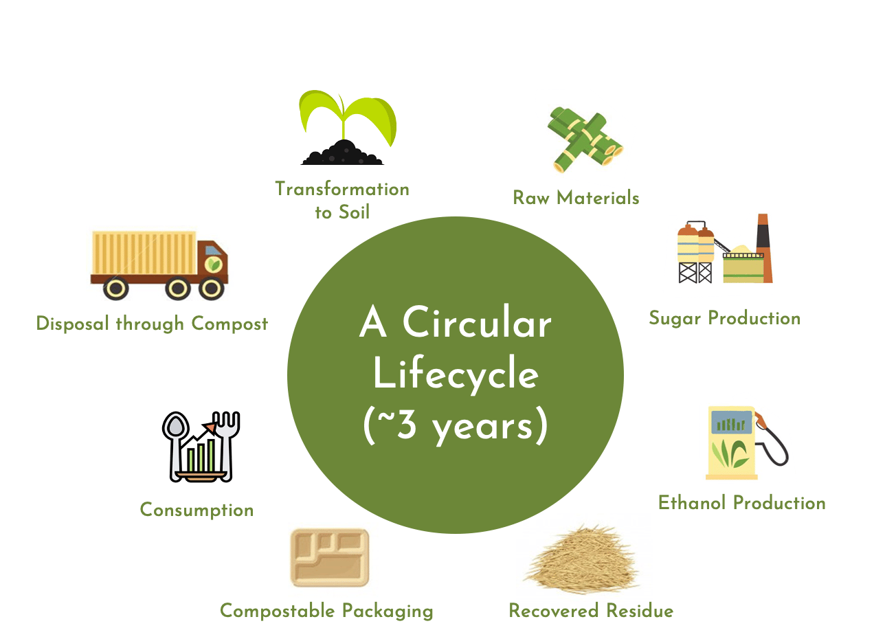
Material Life Cycle
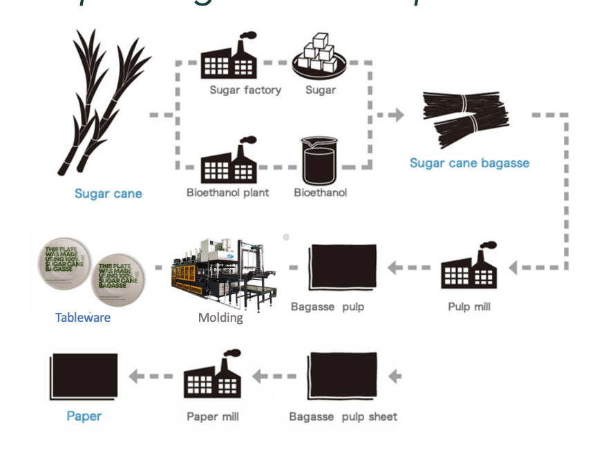
Follows the material from sugar cane to finished product. Bagasse is the fibre left over after the sugar is pressed. Understanding this journey helped me turn the story into the packaging copy.
Production Flow
Maps each step from raw material to the finished piece. It helped me see where the brand shows up on the product: printing, forming and final packaging.
Competitor Map
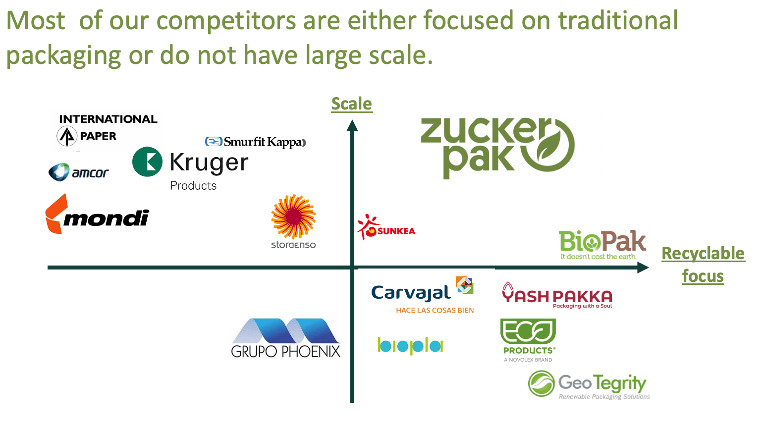
Compares Zuckerpak with other suppliers. Most are either tied to traditional packaging or can’t produce at scale. This showed me where the brand could stand out.
Growth Roadmap
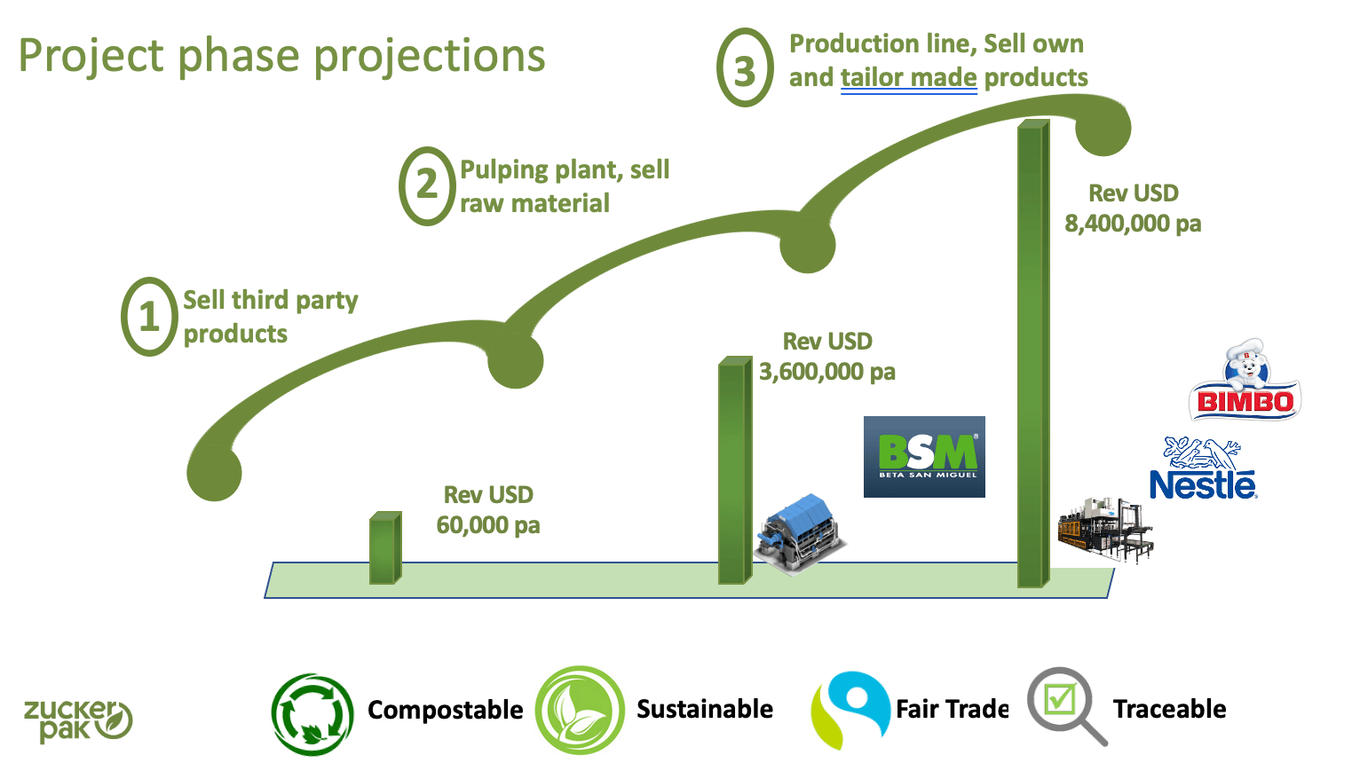
Shows how the range grows over time, from the first products to a wider catalog. Each phase carries the same three ideas: compostable, renewable, sustainable.
Brand Strategy
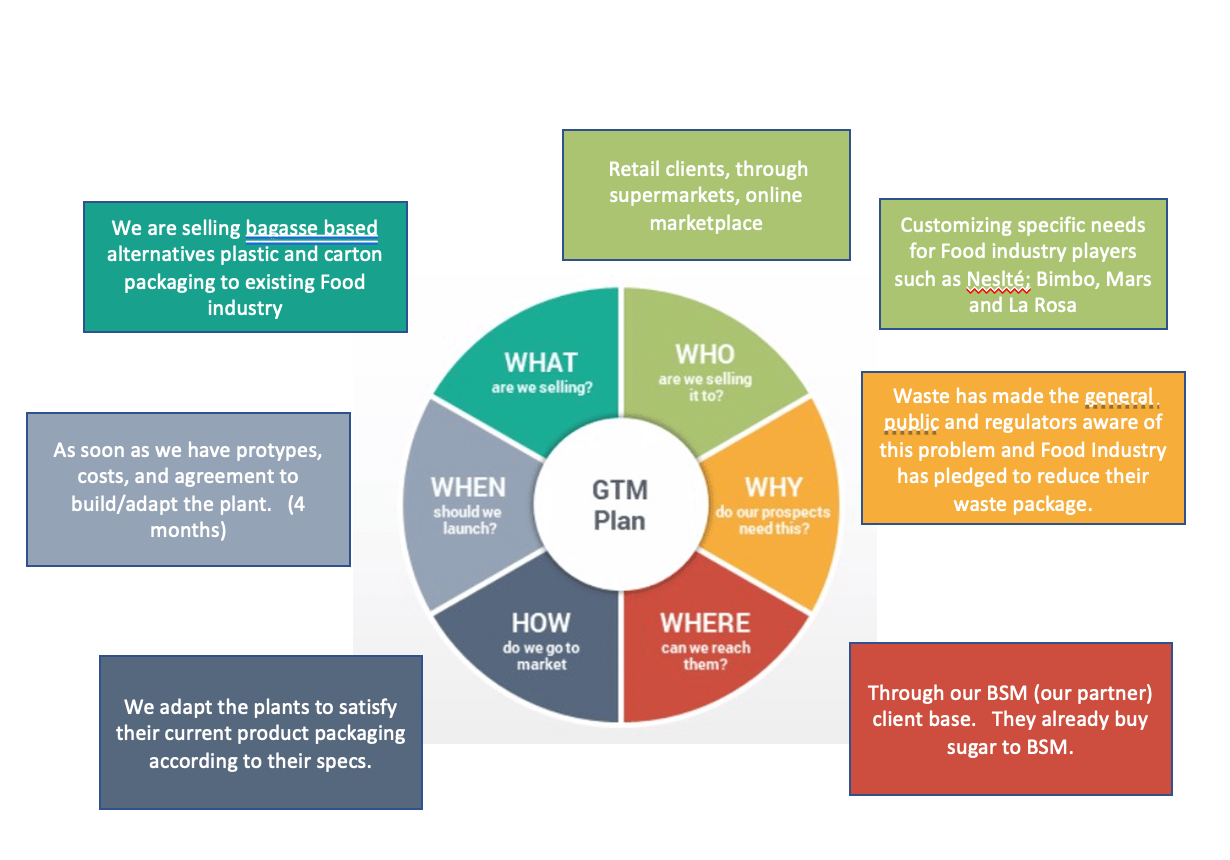
Organizes the brand’s values, audiences and messages in one view. This became the base for the tone of voice and every design decision after it.
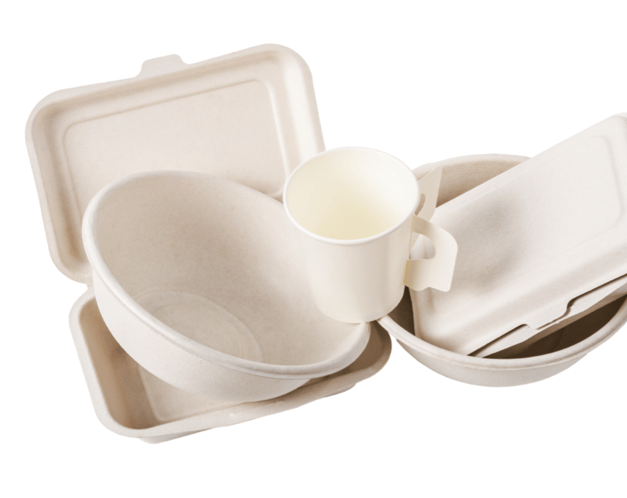
Product Range
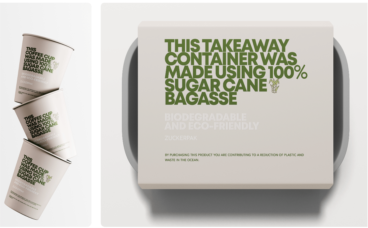
The core products: takeaway containers, bowls and cups. All share the same material, the same shapes and the same visual language.
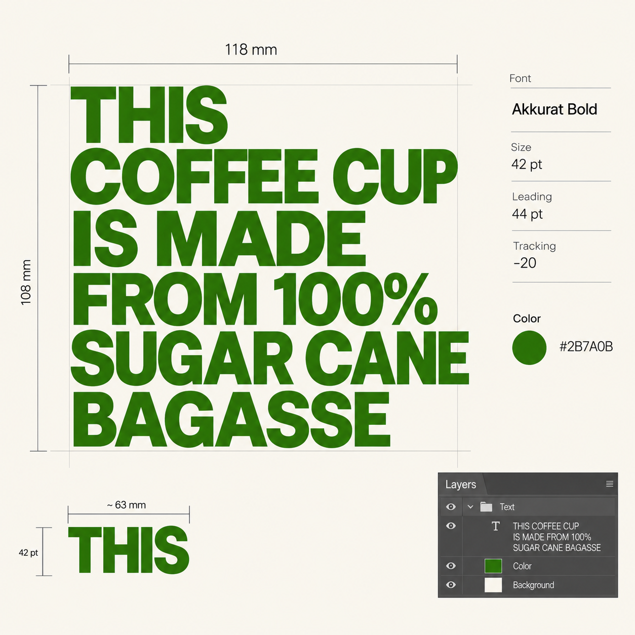
Packaging Design
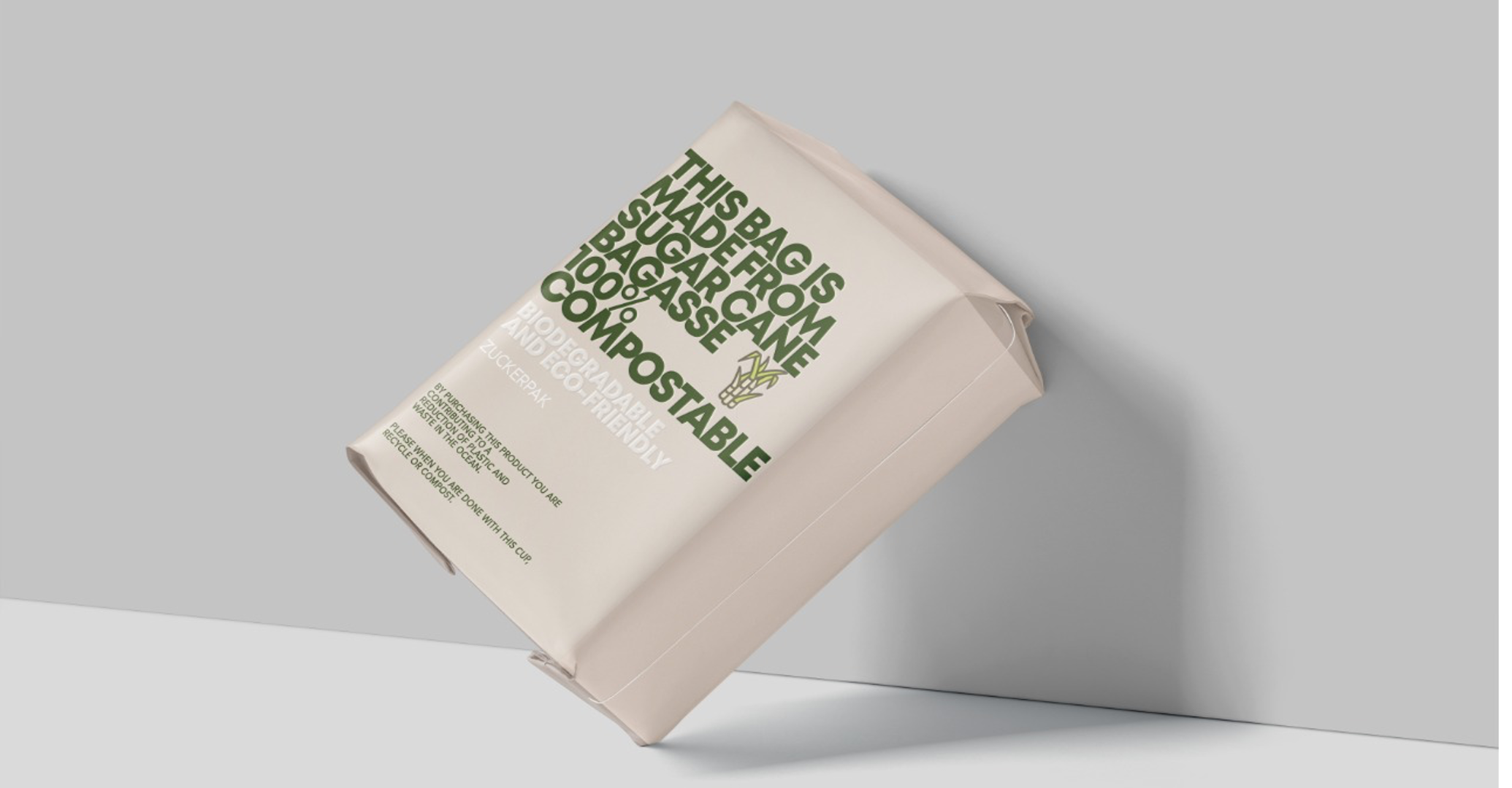
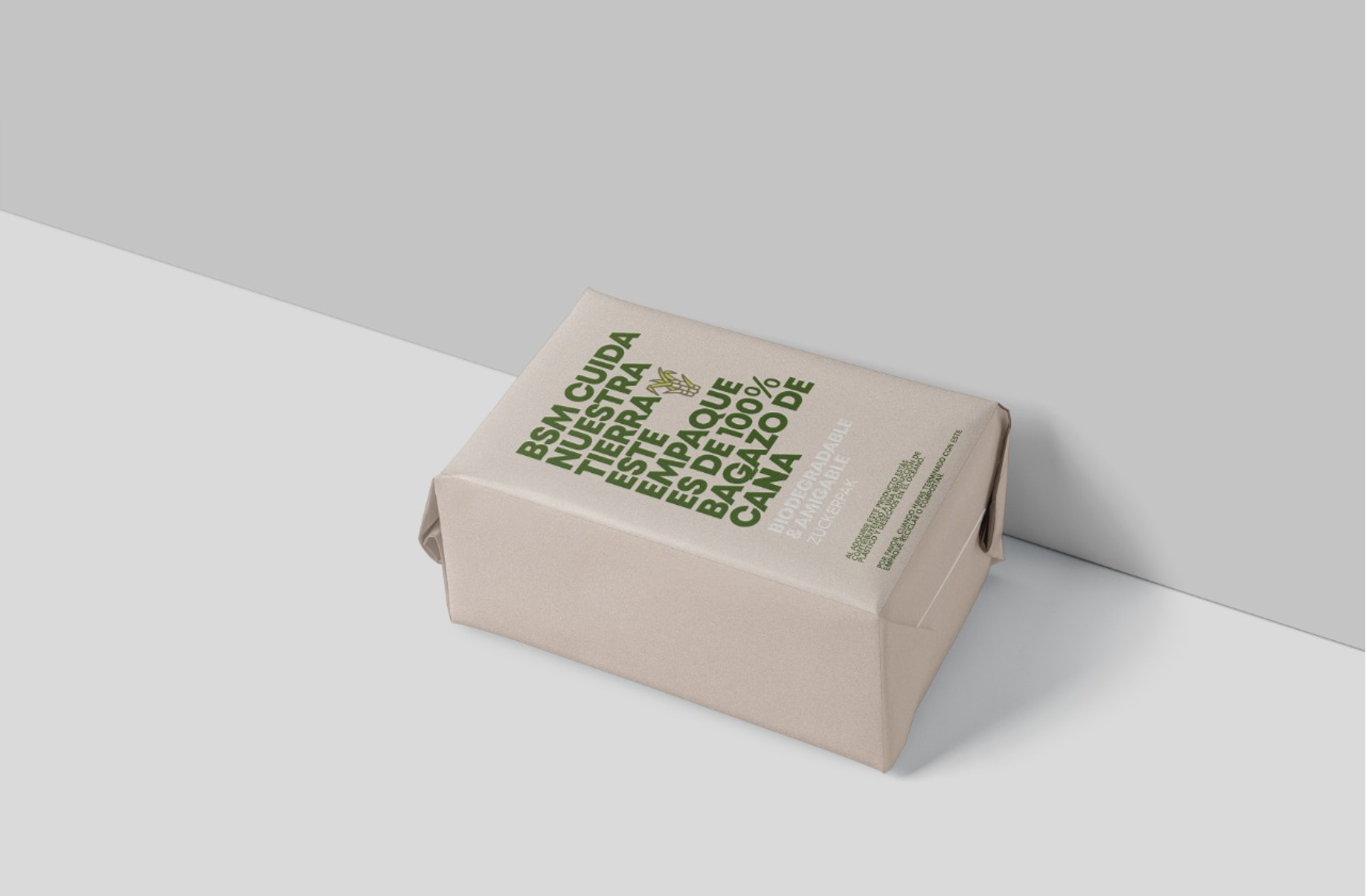
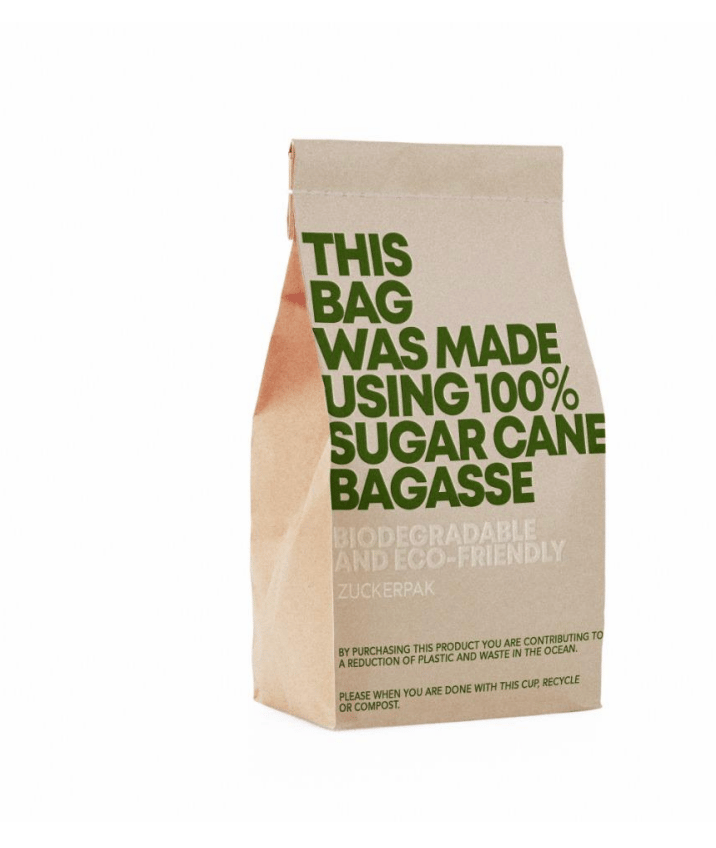
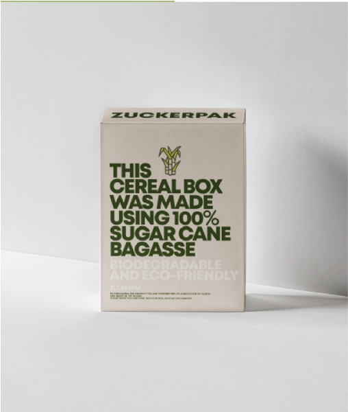
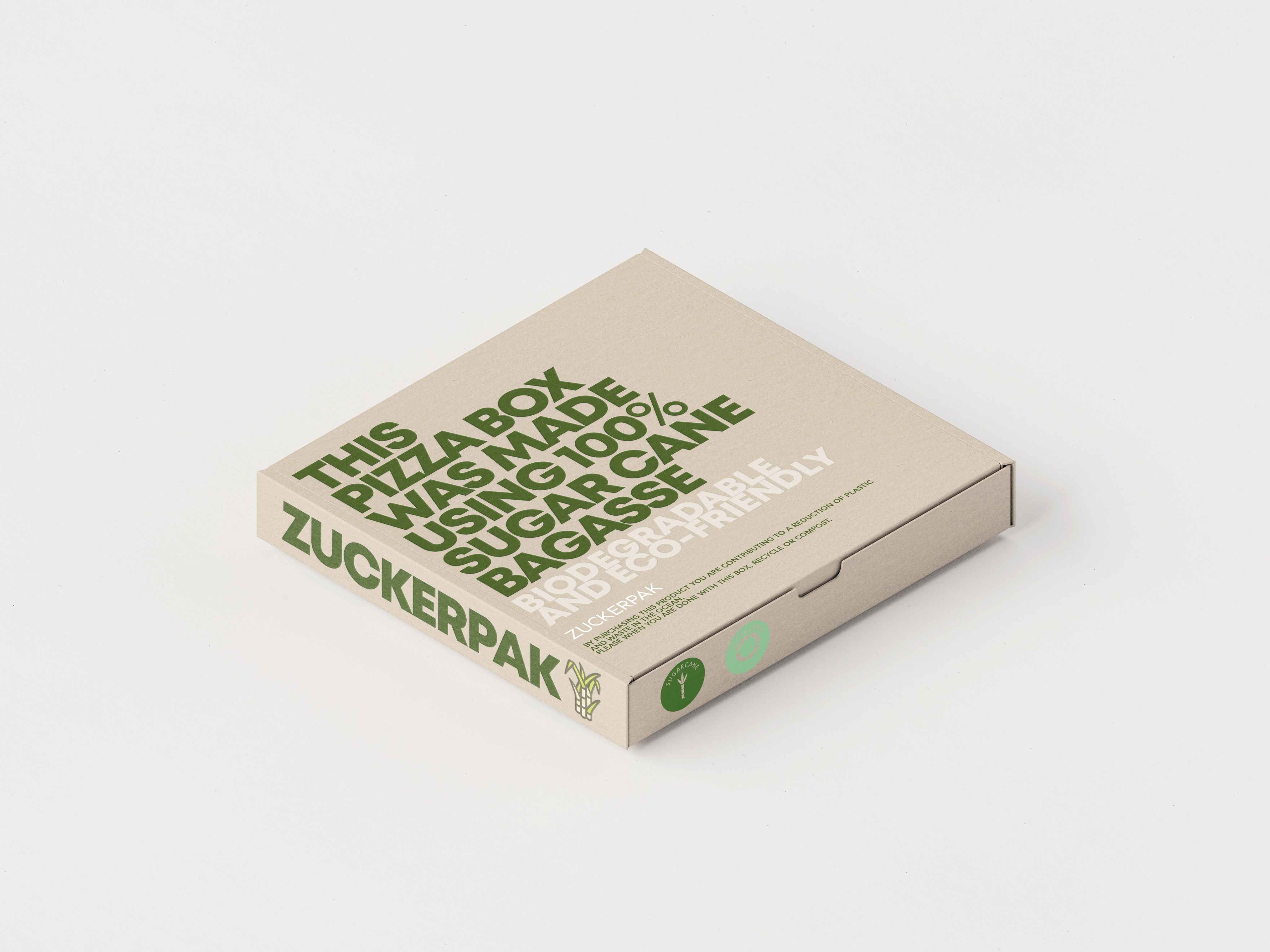
The final system in use. Large typography, a single green, and the message printed directly on the material. It is simple to produce and easy to recognize.