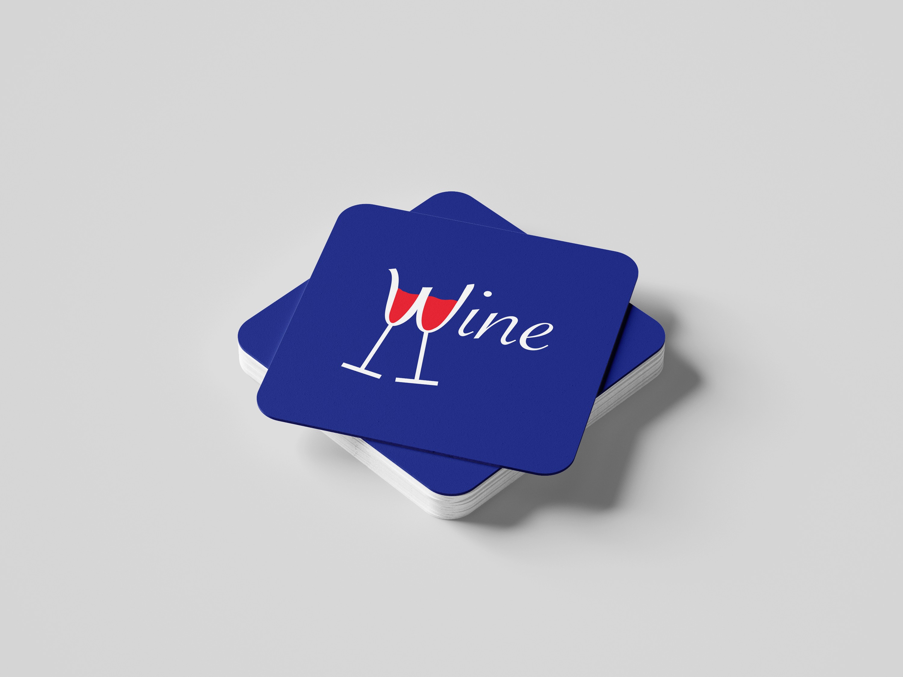
Logo Design x fair.

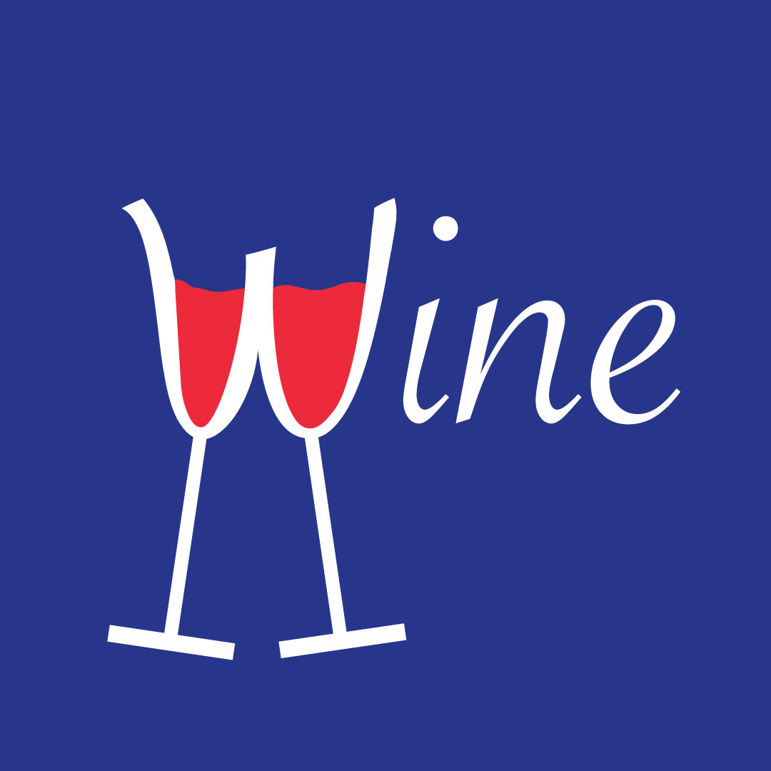
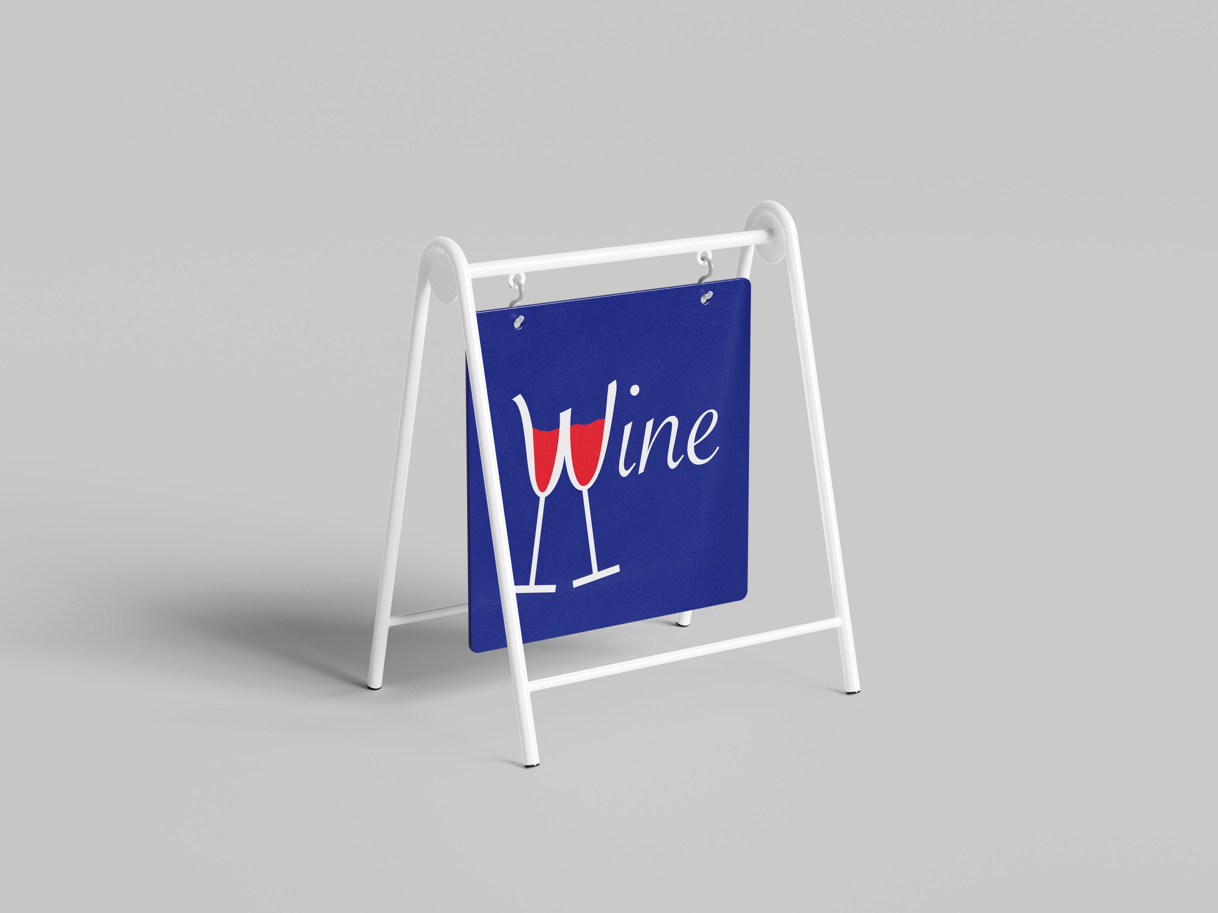
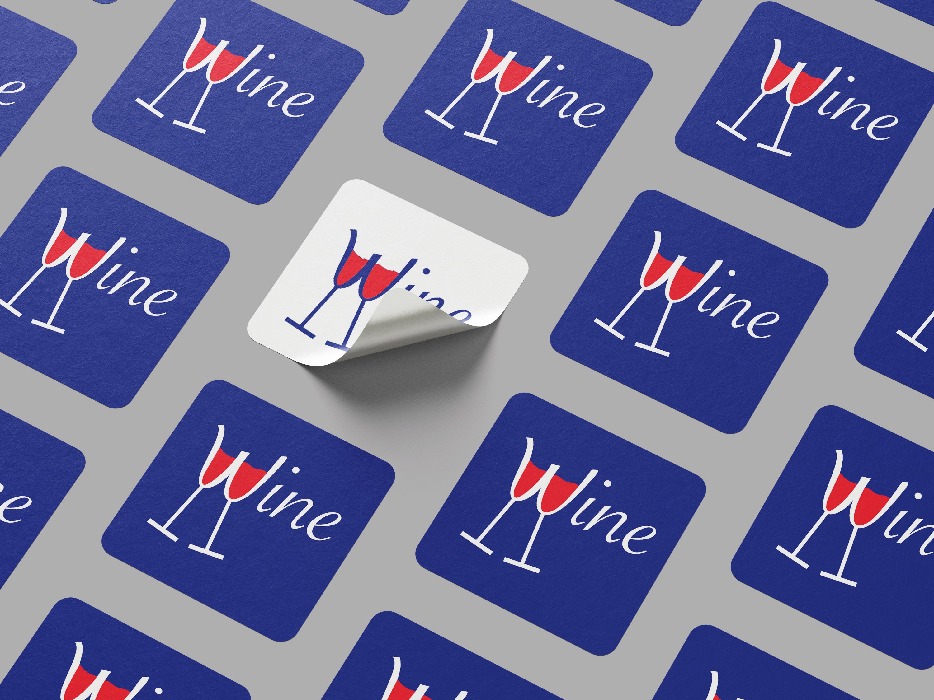
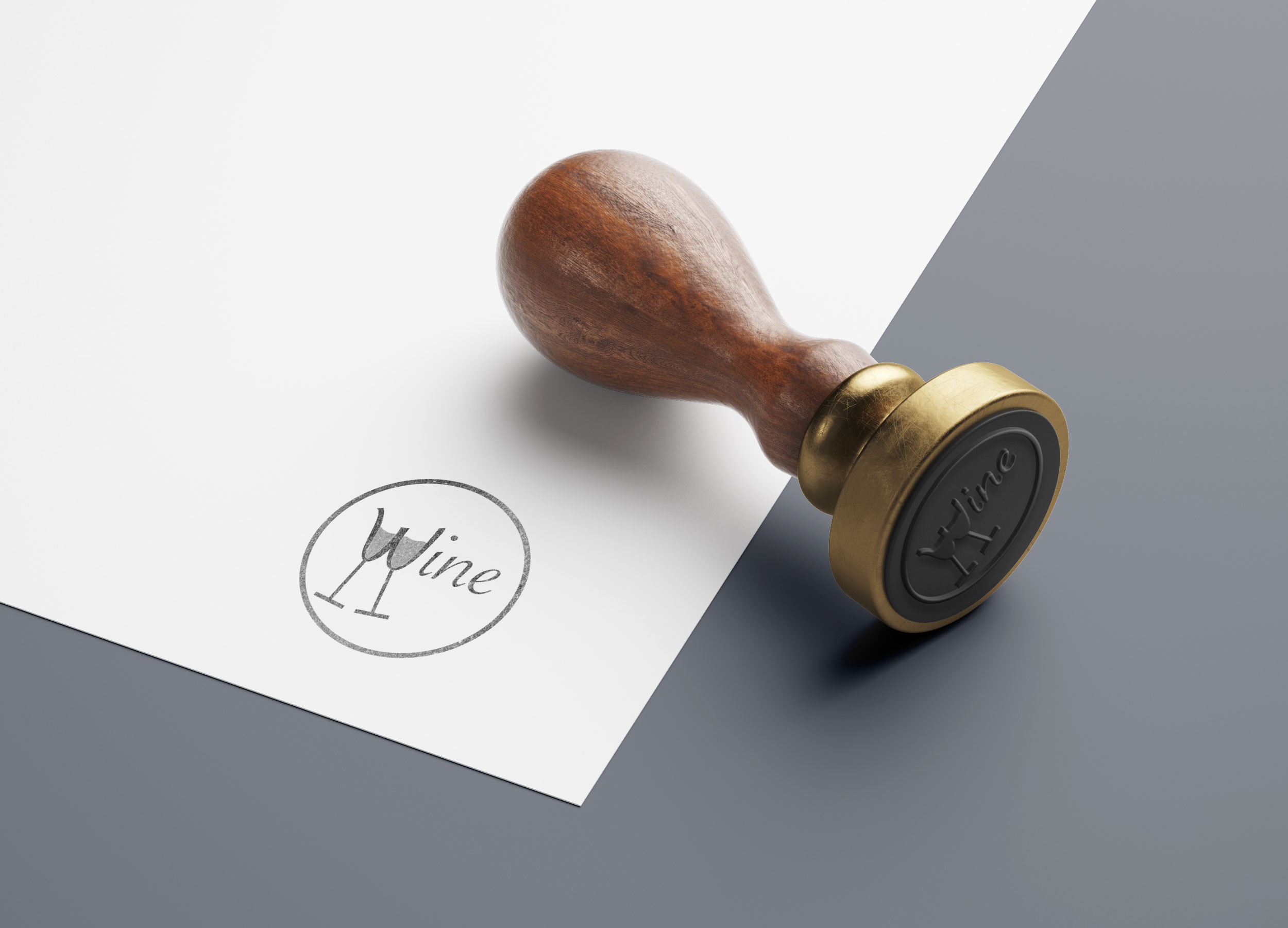
Designed a logo for a French wine stand at an international fair, working within a 3 color constraint to create the visual design.
Constraints are a creative tool.

Three colors can tell a full story.

French heritage guided every decision.

Simplicity makes a logo memorable.

Color carries cultural meaning.

Wine culture is a thing.

A logo must work at any size.

Identity design begins with research.

The flag became the palette.

Craft and tradition guided the form.

Good design respects its context.

A mark could feel French.

plant
plant
red flower

Brand Brief

Defined the visual constraints and creative direction: a logo representing a French wine stand, using only three ink colors.

white flower

Visual Research

Explored French wine culture, typographic heritage and flag color applications to identify a visual language that feels authentic and distinctive.

red flower

User Persona

Created frames to define key layouts and prioritize product discovery and usability across mobile and desktop.

white flower

Logo Sketches

Developed three initial logo concepts by hand, exploring different approaches to form, symbol and lettering within the color constraints.

Design Systems

Branding

UI/UX

Logo Design x fair.

Designed a logo for a French wine stand at an international fair, working within a 3 color constraint to create the visual design.
Constraints are a creative tool.

Three colors can tell a full story.

French heritage guided every decision.

Simplicity makes a logo memorable.

Color carries cultural meaning.

Wine culture is a thing.

A logo must work at any size.

Identity design begins with research.

The flag became the palette.

Craft and tradition guided the form.

Good design respects its context.

A mark could feel French.

plant
plant
red flower

Brand Brief

Defined the visual constraints and creative direction: a logo representing a French wine stand, using only three ink colors.

Visual Research

Explored French wine culture, typographic heritage and flag color applications to identify a visual language that feels authentic and distinctive.

white flower
red flower

User Persona

Created frames to define key layouts and prioritize product discovery and usability across mobile and desktop.

Logo Sketches

Developed three initial logo concepts by hand, exploring different approaches to form, symbol and lettering within the color constraints.

white flower

Design Systems

Branding

UI/UX

Logo Design x fair.

Designed a logo for a French wine stand at an international fair, working within a 3 color constraint to create the visual design.
Constraints are a creative tool.

Three colors can tell a full story.

French heritage guided every decision.

Simplicity makes a logo memorable.

Color carries cultural meaning.

Wine culture is a thing.

A logo must work at any size.

Identity design begins with research.

The flag became the palette.

Craft and tradition guided the form.

Good design respects its context.

A mark could feel French.
plant
plant
  1. red flower

    Brand Brief

    Defined the visual constraints and creative direction: a logo representing a French wine stand, using only three ink colors.
  2. Visual Research

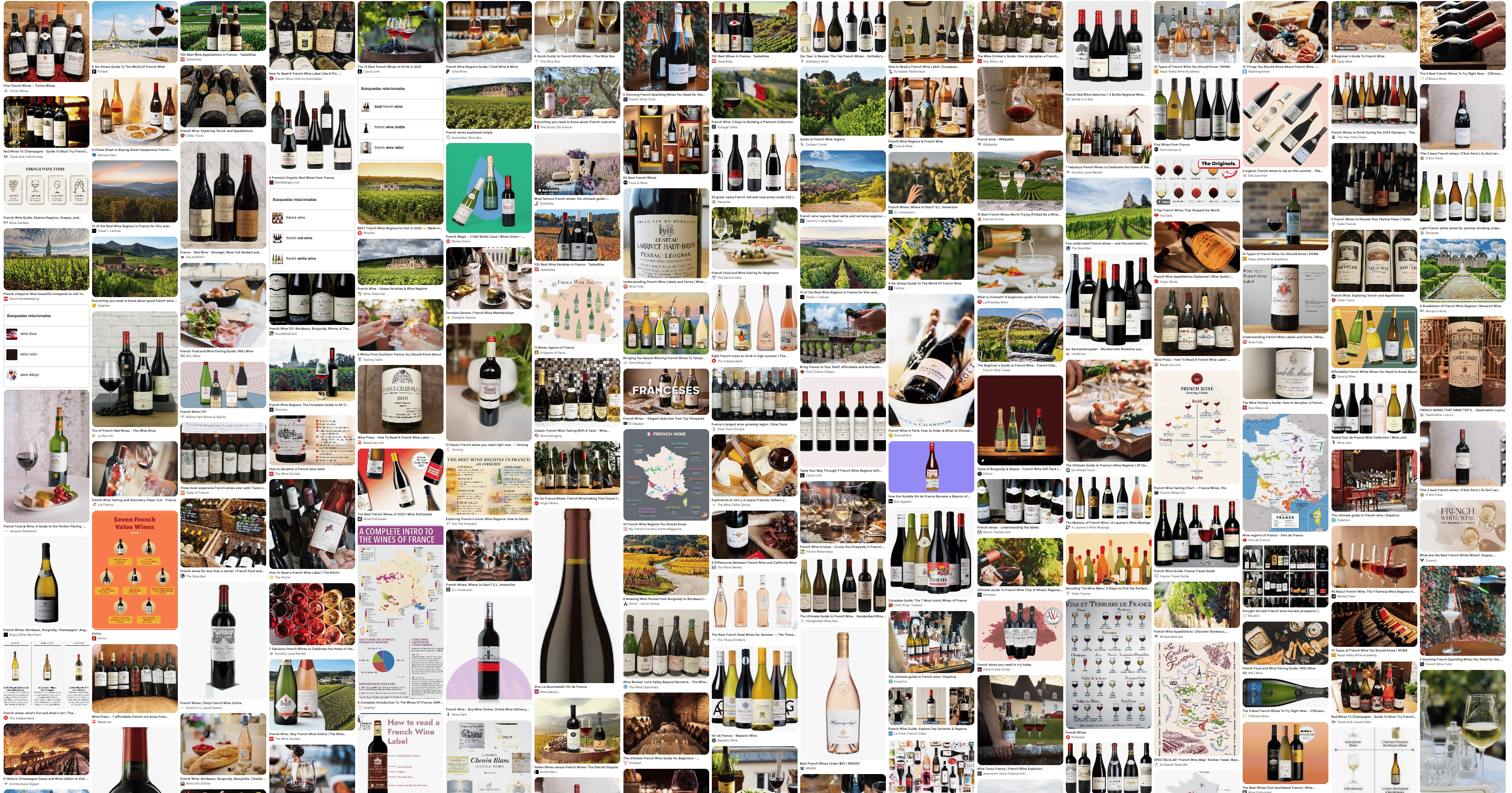
    Explored French wine culture, typographic heritage and flag color applications to identify a visual language that feels authentic and distinctive.
    white flower
  3. red flower

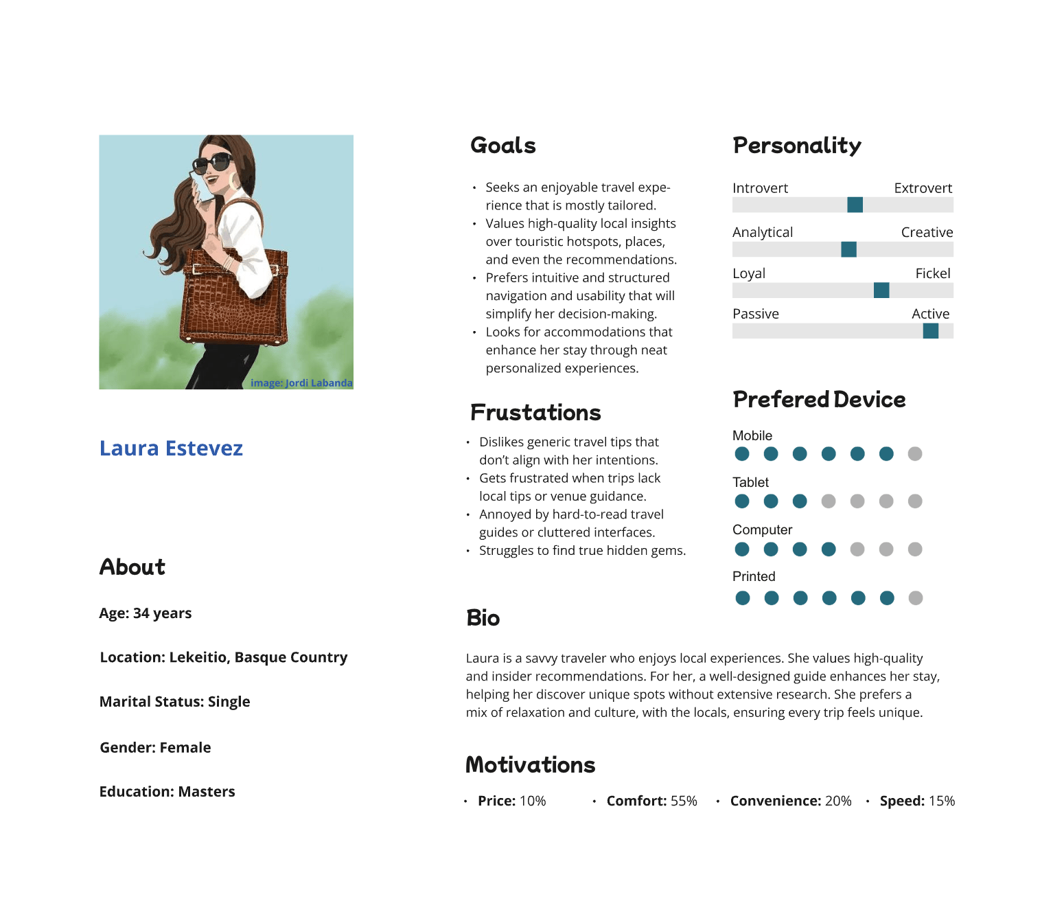
    User Persona

    Created frames to define key layouts and prioritize product discovery and usability across mobile and desktop.
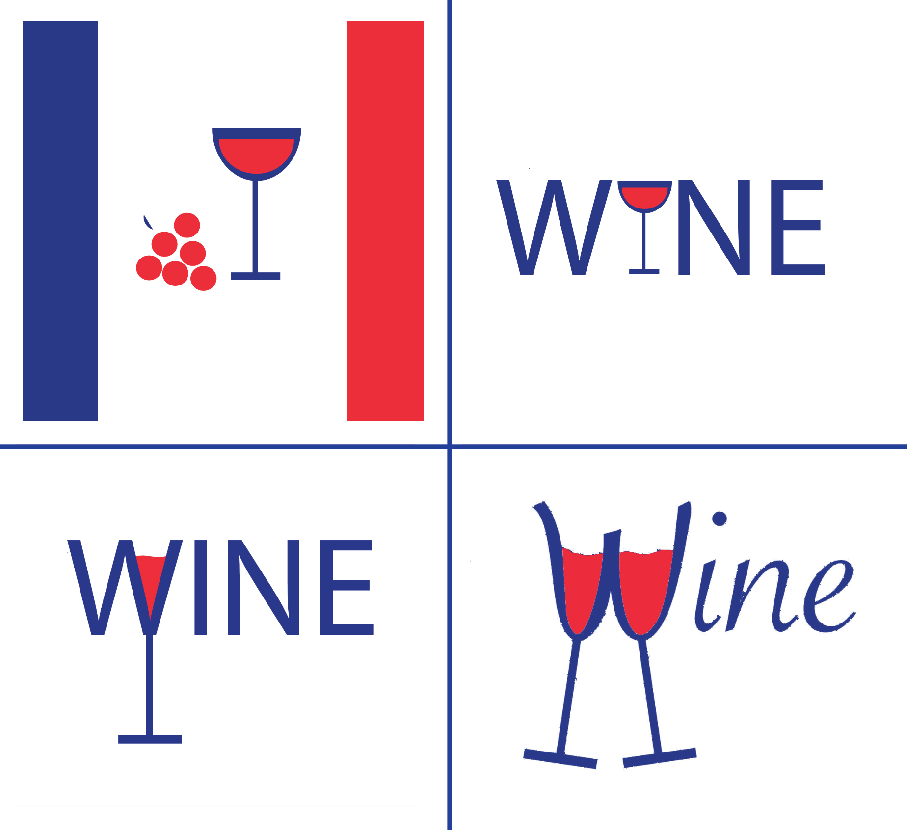
  4. Logo Sketches

    Developed three initial logo concepts by hand, exploring different approaches to form, symbol and lettering within the color constraints.

    white flower