Marisol

Work

About

Branding Design.

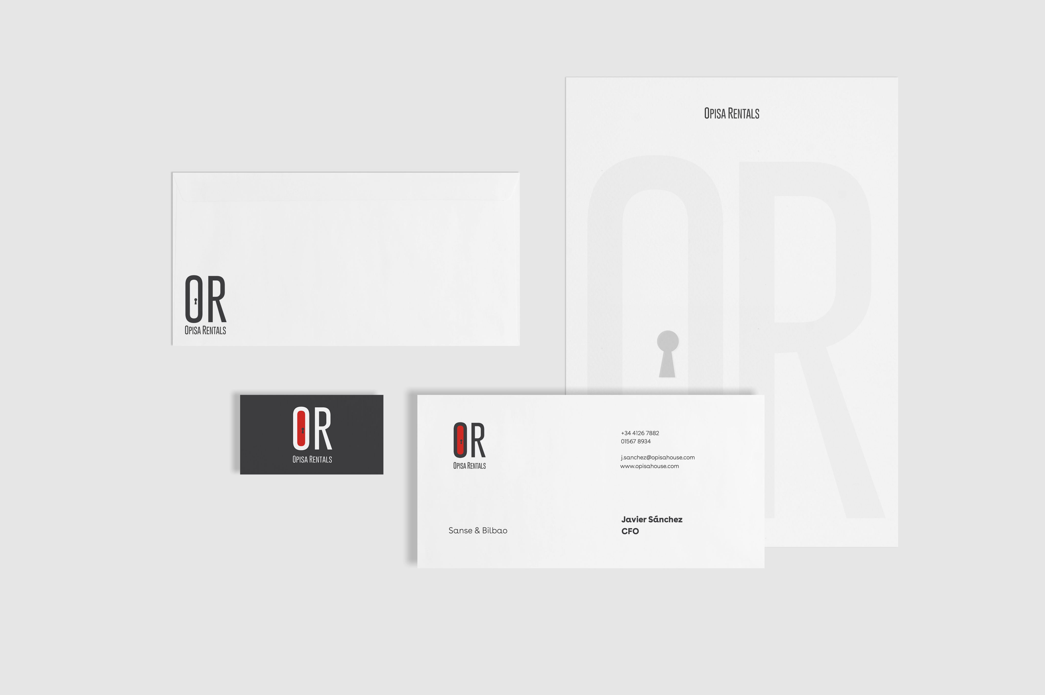
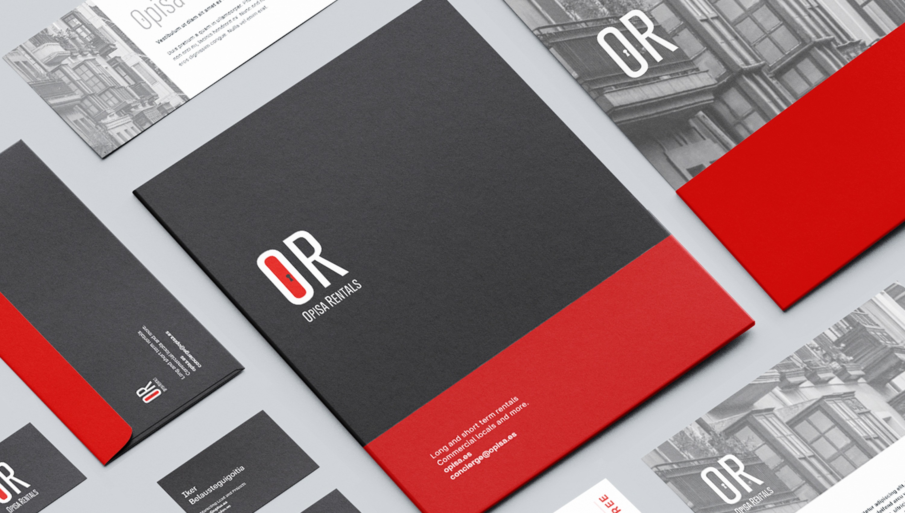
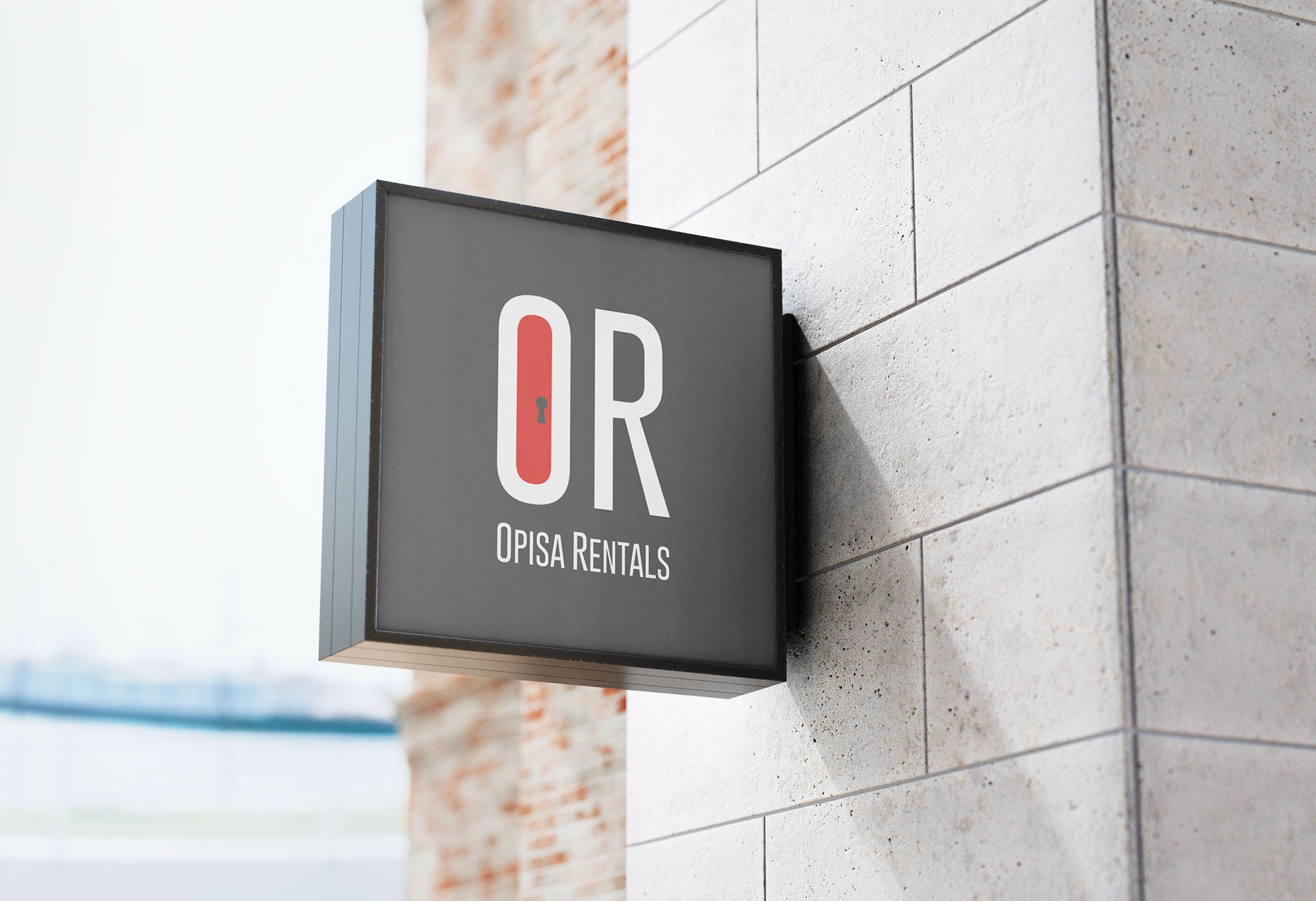
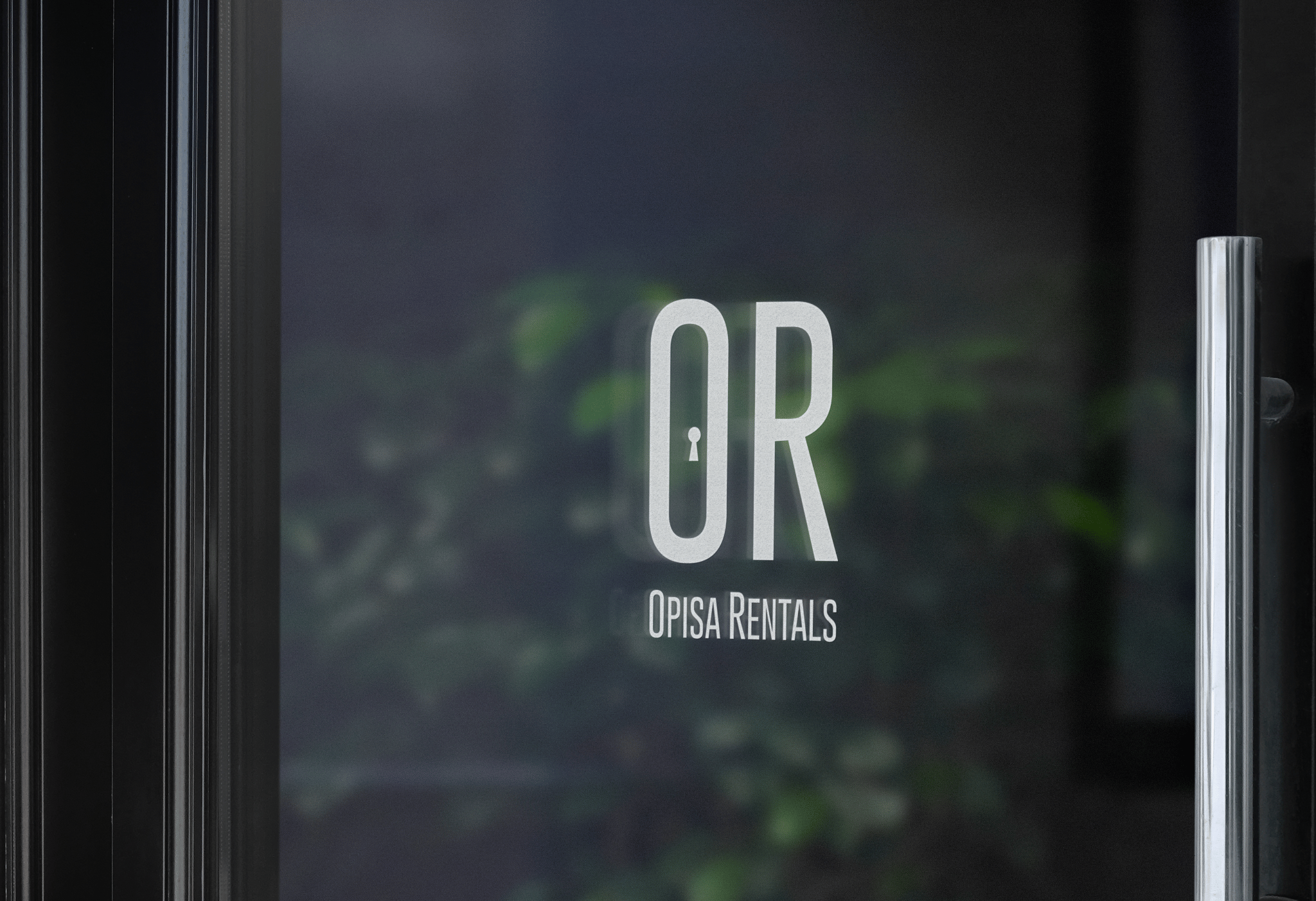
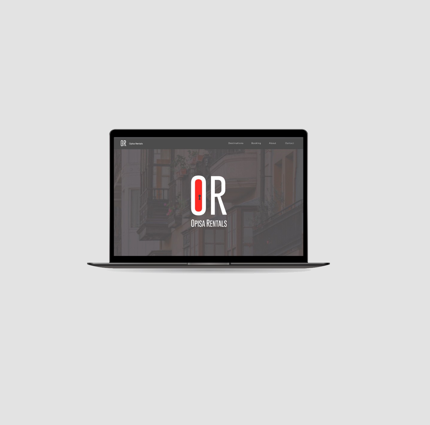
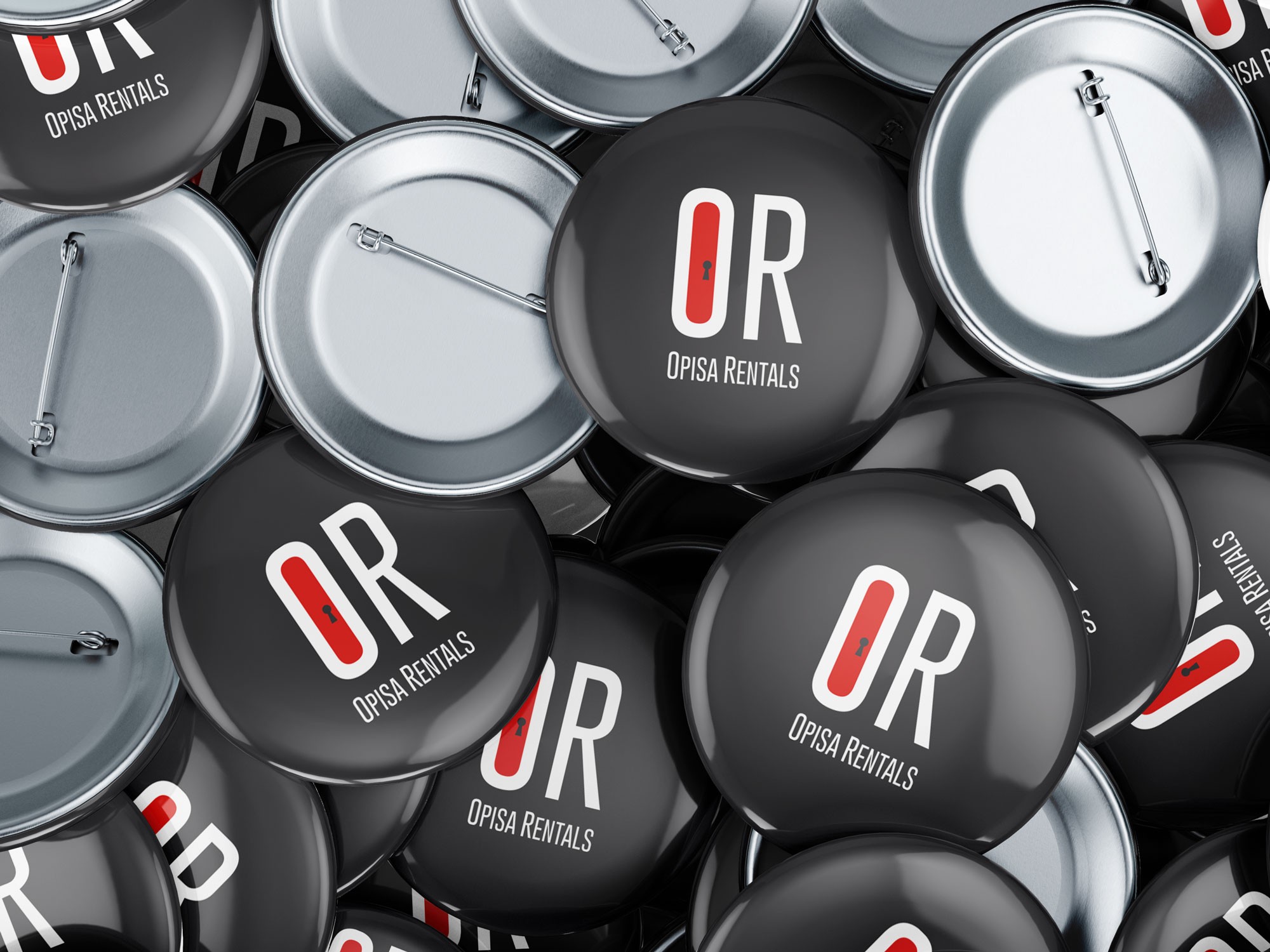
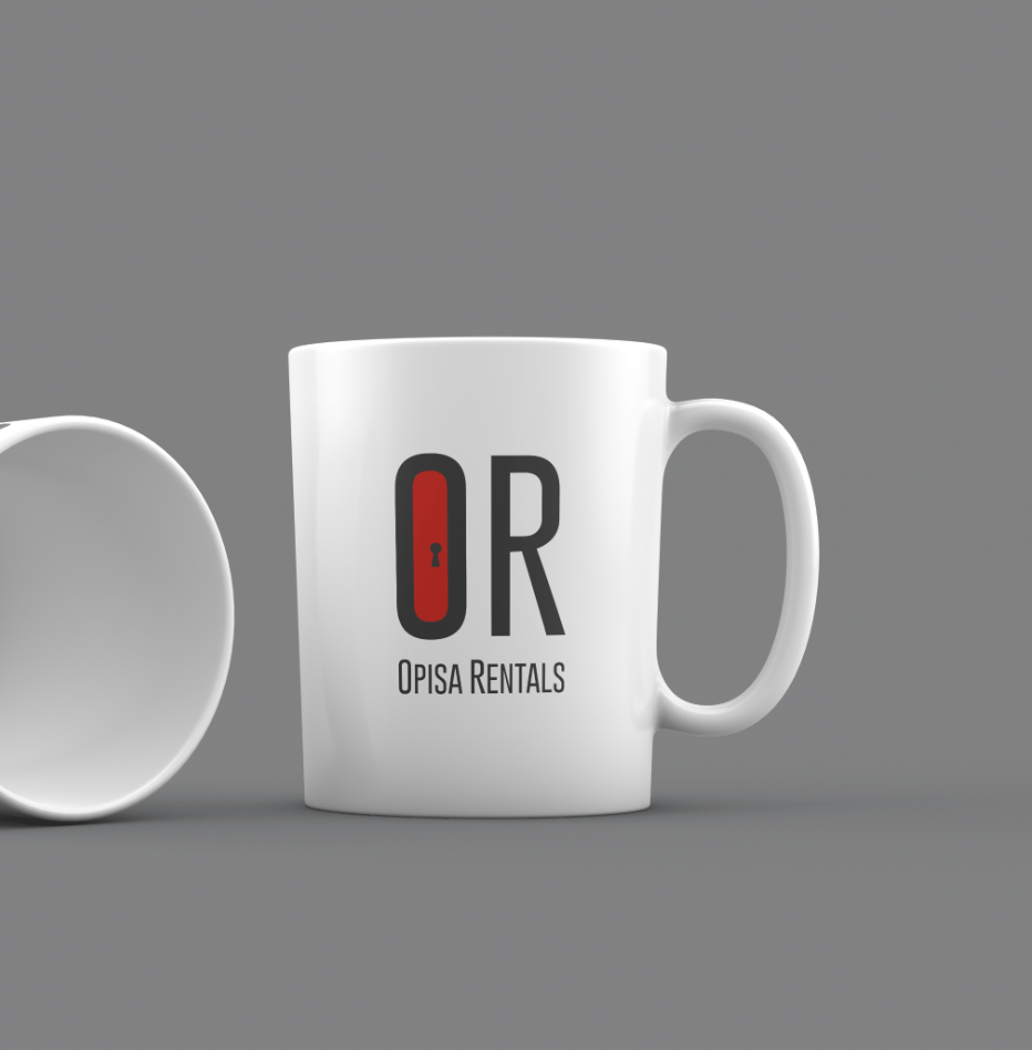
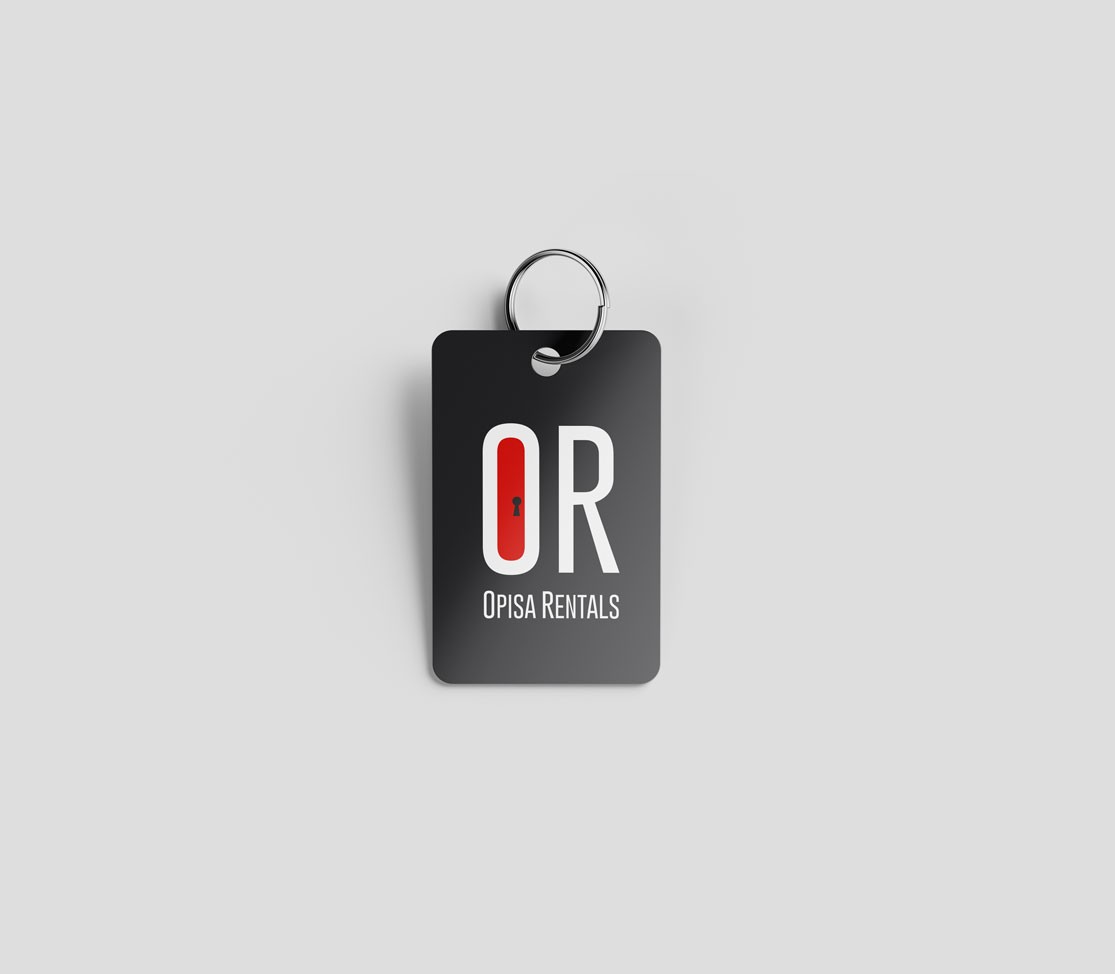
Built a complete brand identity and design

system for a Real Estate company, establishing visual consistency with physical brand presence.

white flower

WCAG

Brand Design UI Design

UX Design

​

pink flower on blue sky
white flower

01

User Research

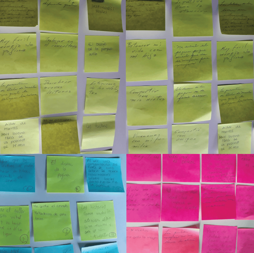
Conducted interviews with the target audience for insights to understand expectations and gathered useful insights.
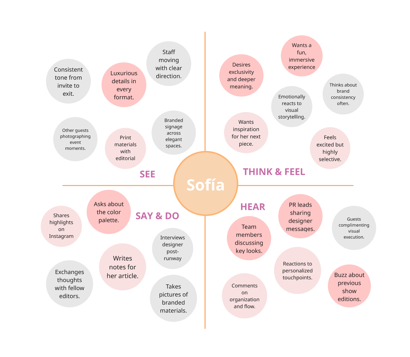
02

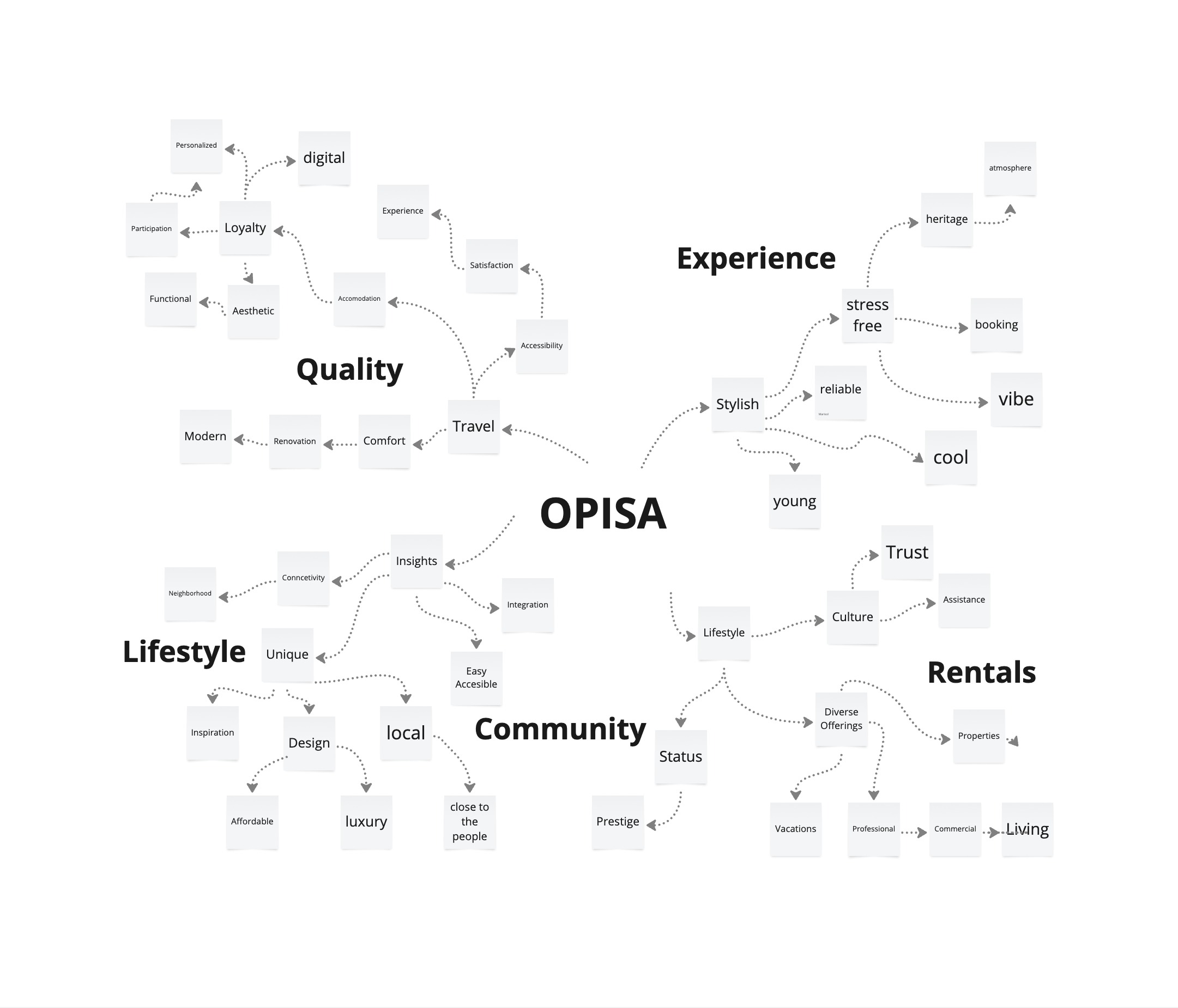
Organized the core brand values into main key themes, each one is branched into attributes related to OPISA.

03

Brand Pyramid

Categorized the values from common attributes to more specific aspects all the way to distinctive ones. Helped prioritize which values drive the brand and how they shape customer perception.

04

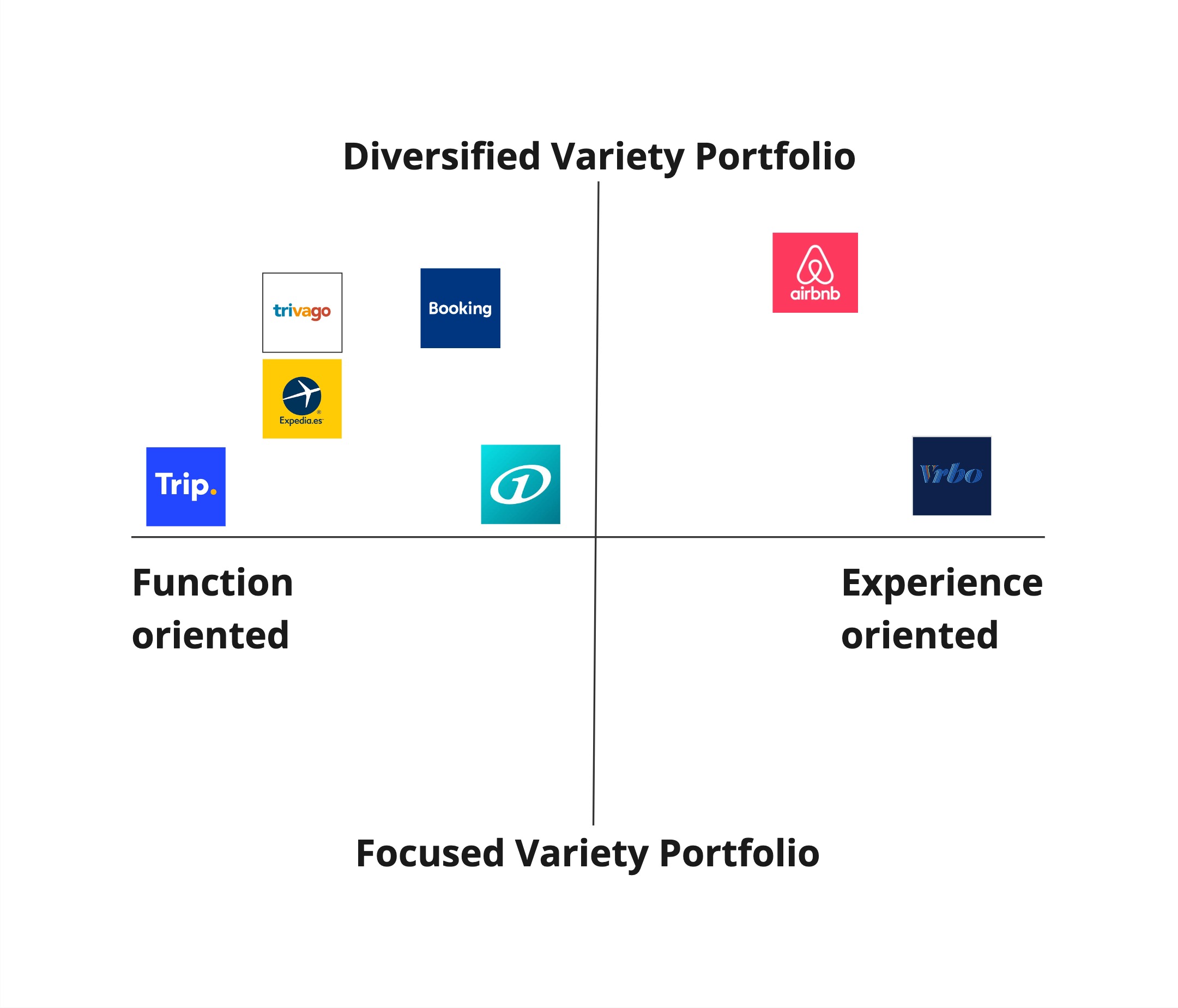
Positioning Cross

Analyzed key competitors to pinpoint successful features. Found out the gap for acommodations that have both variety in destinations and experience oriented stays.

05

How-Why-What

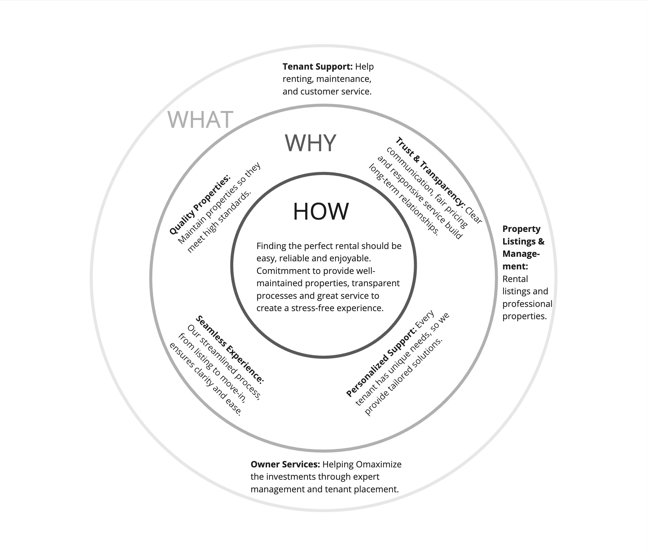
Identified the purpose, strategy and offerings, emphasizing community-driven, stylish and secure tailored rentals.

06

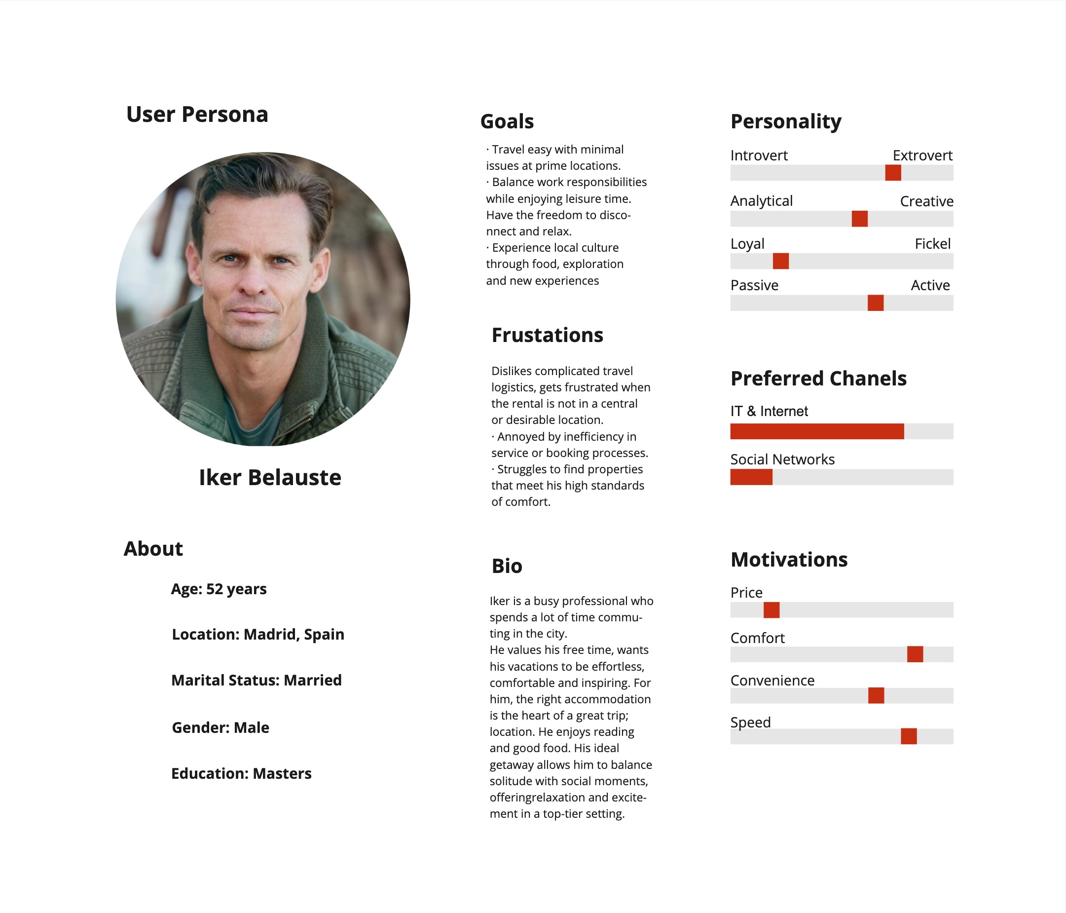
Persona Development

Created detailed user personas, including Iker and Samu, to represent our target audience.

07

User Research

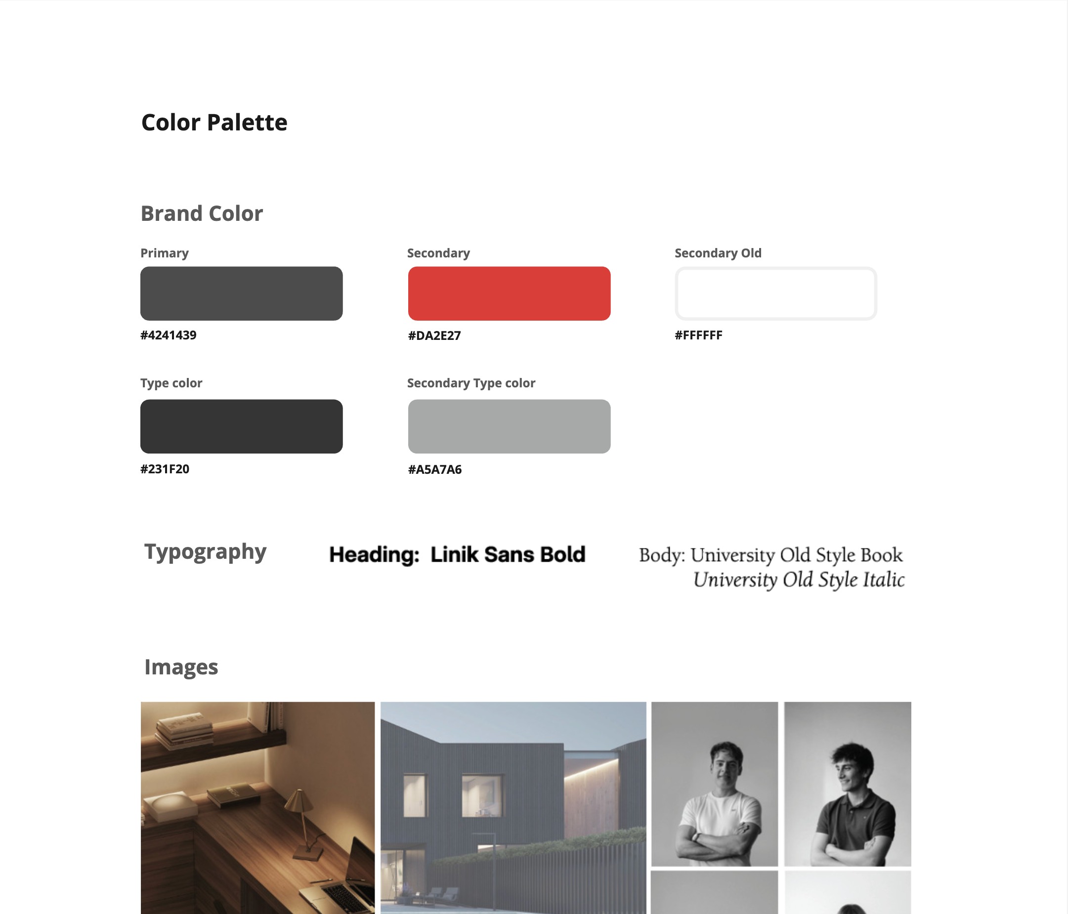
Made a design system inspired by tech aesthetics, incorporating sleek and bold features that reflect the brands values.

08

Logo Drafts

Sketched different versions, playing with the brand’s identity and colors.

09

Logo Design

Designed proportional and balanced logo that hints the company’s mission while having an easily adapted design.

The Result

I believe

A brand is a living system.

Consistency is the foundation of trust.

Every element has a purpose.

Visual language unifies the message.

A strong logo anchors everything.

Typography carries the brand voice.

Color creates instant recognition.

A brand is felt before it is read.

Guidelines empower the whole team.

Scalability is built in from the start.

Identity is strategy made visible.

Systems outlast individual assets.

Marisol

Spanish + Mexican Designer

​

Linkedin

marisolgdesign@gmail.com

Based in Berlin, available worldwide

Marisol

Work

About

Branding Design.

Built a complete brand identity and design

system for a Real Estate company, establishing visual consistency with physical brand presence.

white flower

Corporate Identity | Visual Design | Logo Design | Print Design | Design System

​

pink flower on blue sky
white flower

01

User Research

Conducted interviews with the target audience for insights to understand expectations and gathered useful insights.
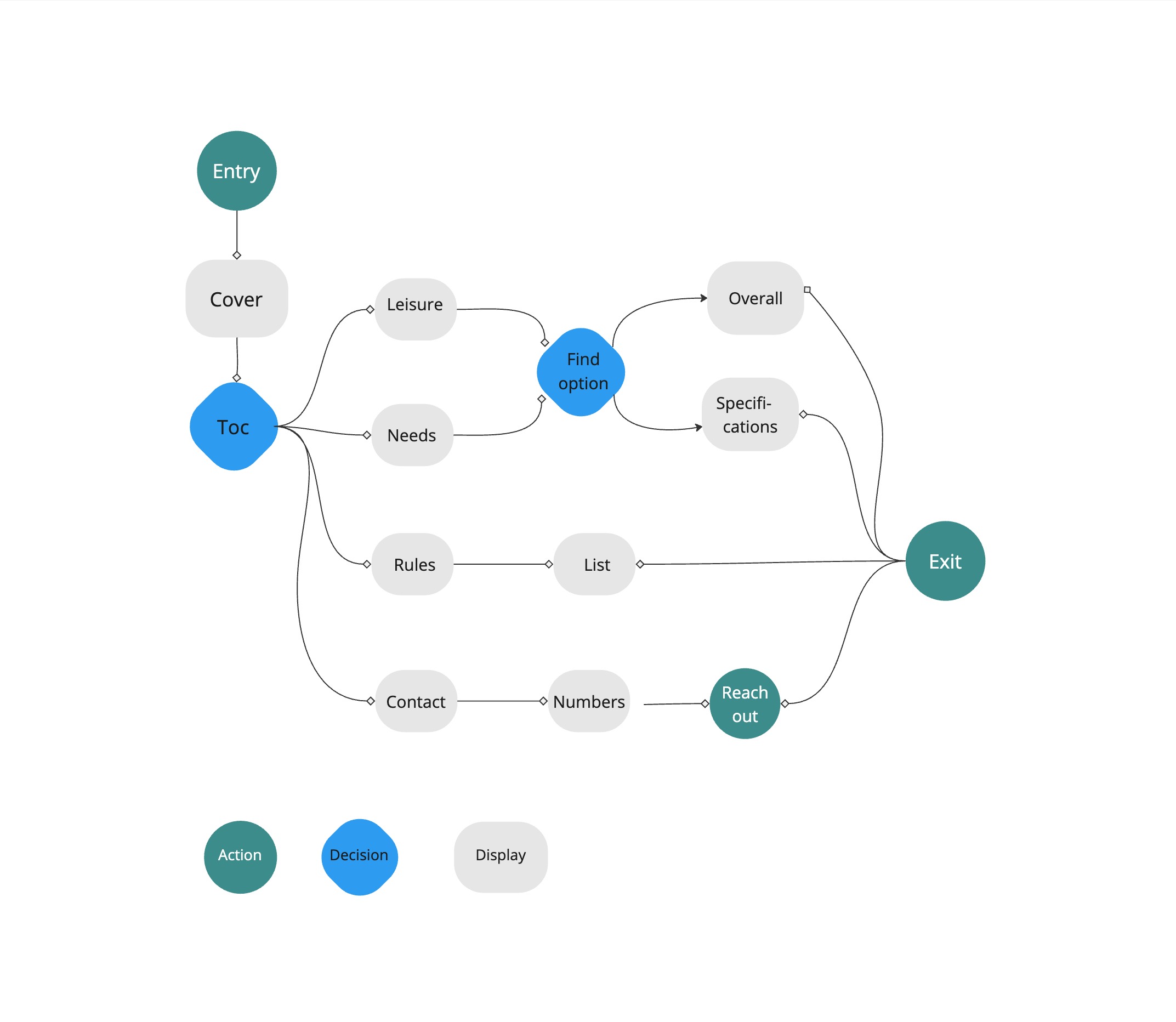
02

Organized the core brand values into main key themes, each one

is branched into attributes related to OPISA.

03

Brand Pyramid

Categorized the values from common attributes to more specific aspects all the way to distinctive ones. Helped prioritize which values drive the brand and how they shape customer perception.

04

Positioning Cross

Analyzed key competitors to pinpoint successful features. Found out the gap for acomodations that have both variety in destinations and experience oriented stays.

05

How-Why-What

Identified the purpose, strategy and offerings, emphasizing community-driven, stylish and secure tailored rentals.

06

Persona Development

Created detailed user personas, including Iker and Samu, to represent our target audience.

07

User Research

Made a design system inspired by tech aesthetics, incorporating sleek and bold features that reflect the brands values.

08

Logo Drafts

Sketched different versions, playing with the brand’s identity and colors.

09

Logo Design

Designed proportional and balanced logo that hints the company’s mission while having an easily adapted design.

The Result

I believe

A brand is a living system.

Consistency is the foundation of trust.

Every element has a purpose.

Visual language unifies the message.

A strong logo anchors everything.

Typography carries the brand voice.

Color creates instant recognition.

A brand is felt before it is read.

Guidelines empower the whole team.

Scalability is built in from the start.

Identity is strategy made visible.

Systems outlast individual assets.

Marisol

Spanish + Mexican Designer

​

Linkedin

marisolgdesign@gmail.com

Based in Berlin, available worldwide

Branding Design.

Built a complete brand identity and design

system for a Real Estate company, establishing visual consistency with physical brand presence.

white flower

Corporate Identity | Visual Design | Logo Design | Print Design | Design System

​

pink flower on blue sky
white flower
  1. 01

    User Interviews

    Conducted interviews with the target audience for insights to understand expectations and gathered useful insights.
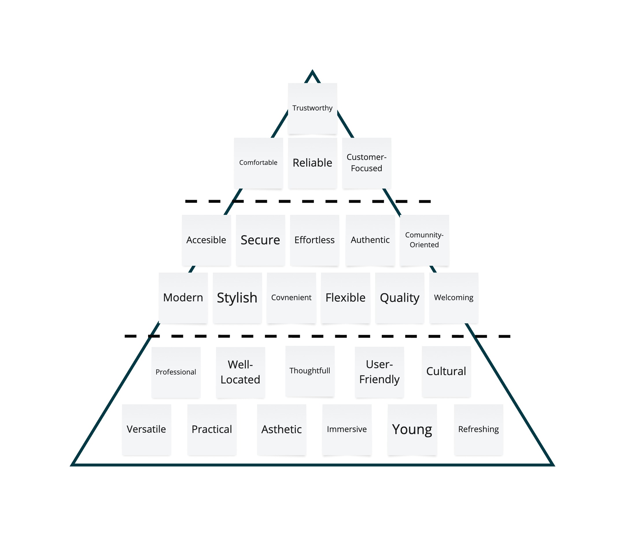
  2. 02

    Organized the core brand values into main key themes, each one is branched into attributes related to OPISA.
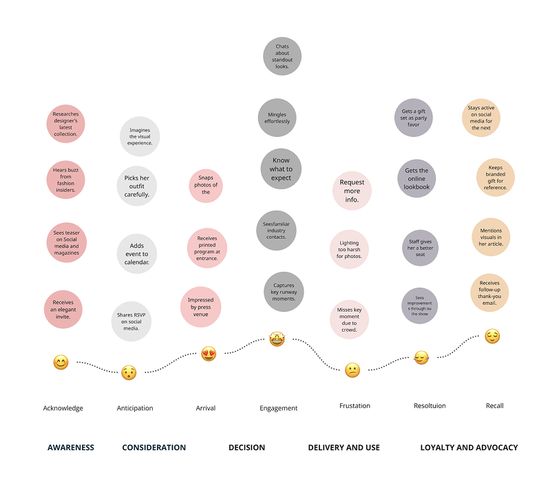
  3. 03

    Brand Pyramid

    Categorized the values from common attributes to more specific aspects all the way to distinctive ones. Helped prioritize which values drive the brand and how they shape customer perception.
  1. 04

    Positioning Cross

    Analyzed key competitors to pinpoint successful features. Found out the gap for acommodations that have both variety in destinations and experience oriented stays.
  2. 05

    How-Why-What

    Identified the purpose, strategy and offerings, emphasizing community-driven, stylish and secure tailored rentals.

  1. 06

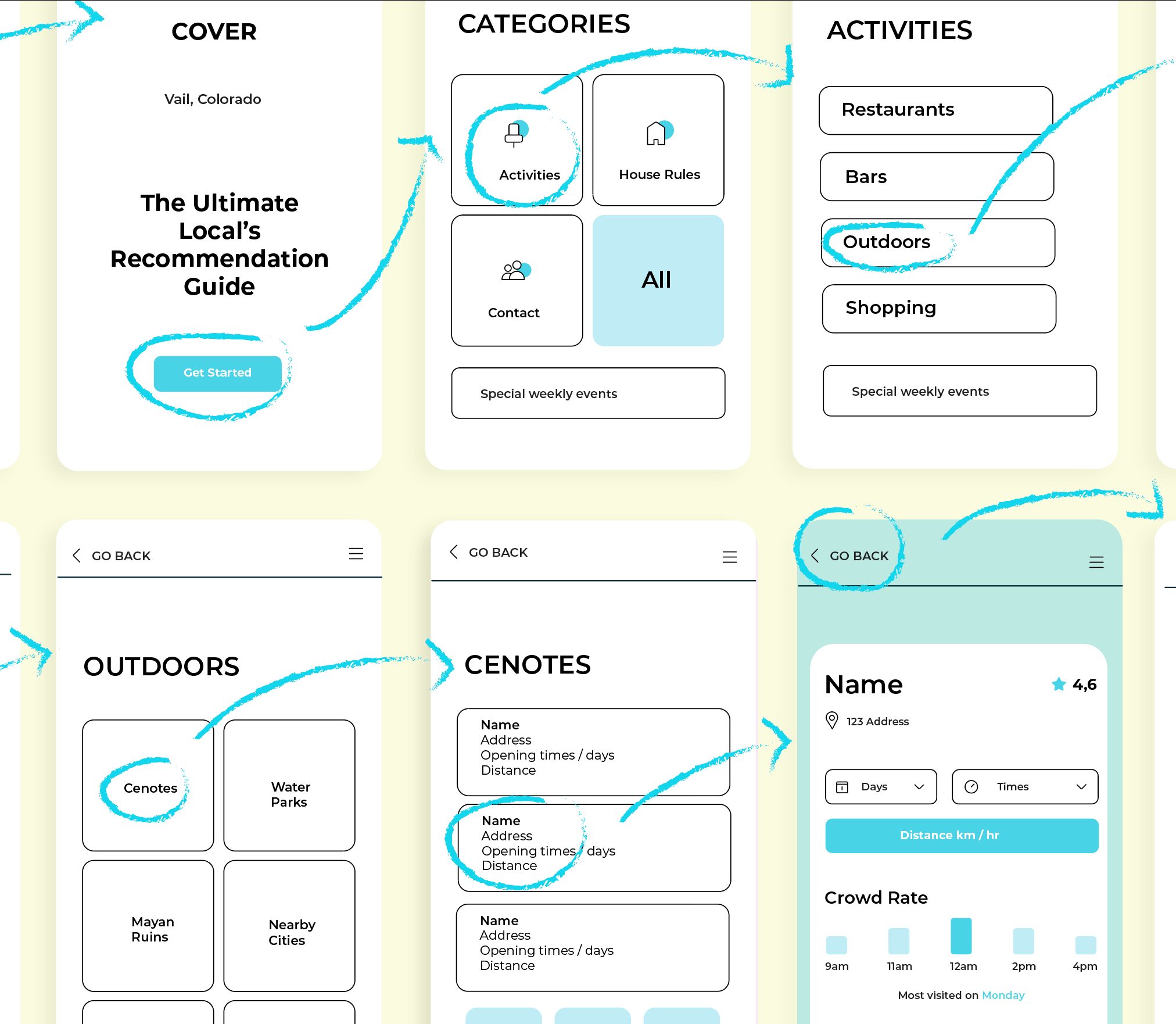
    Persona Development

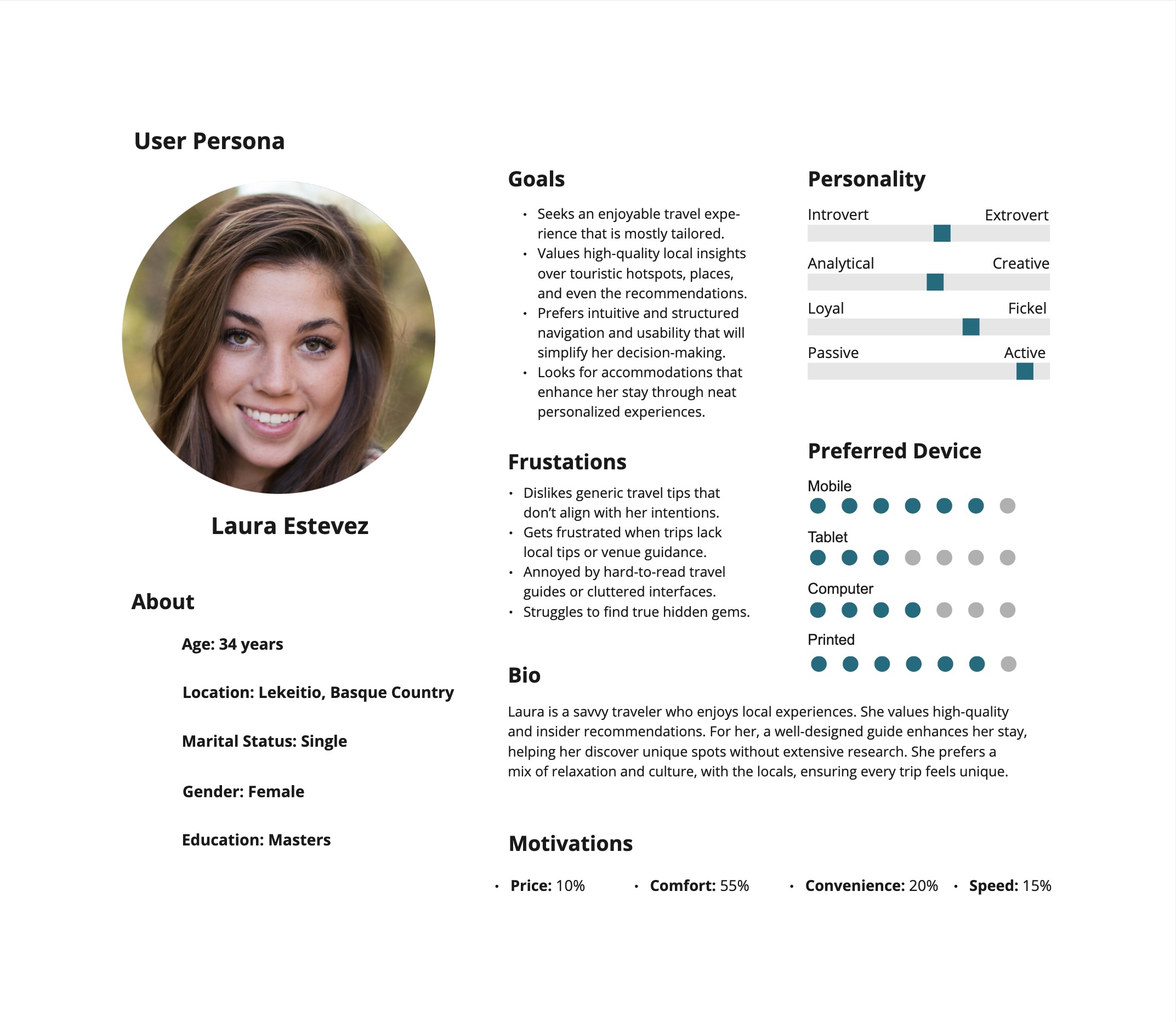
    Created detailed user personas, including Iker and Samu, to represent our target audience.

  1. 07

    Design System

    Made a design system inspired by tech aesthetics, incorporating sleek and bold features that reflect the brands values.
  2. 08

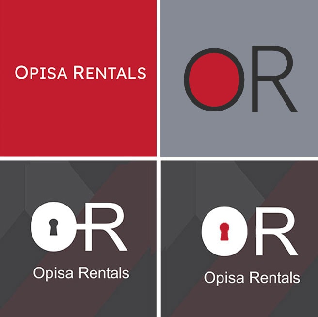
    Logo Drafts

    Sketched different versions, playing with the brand’s identity and colors.
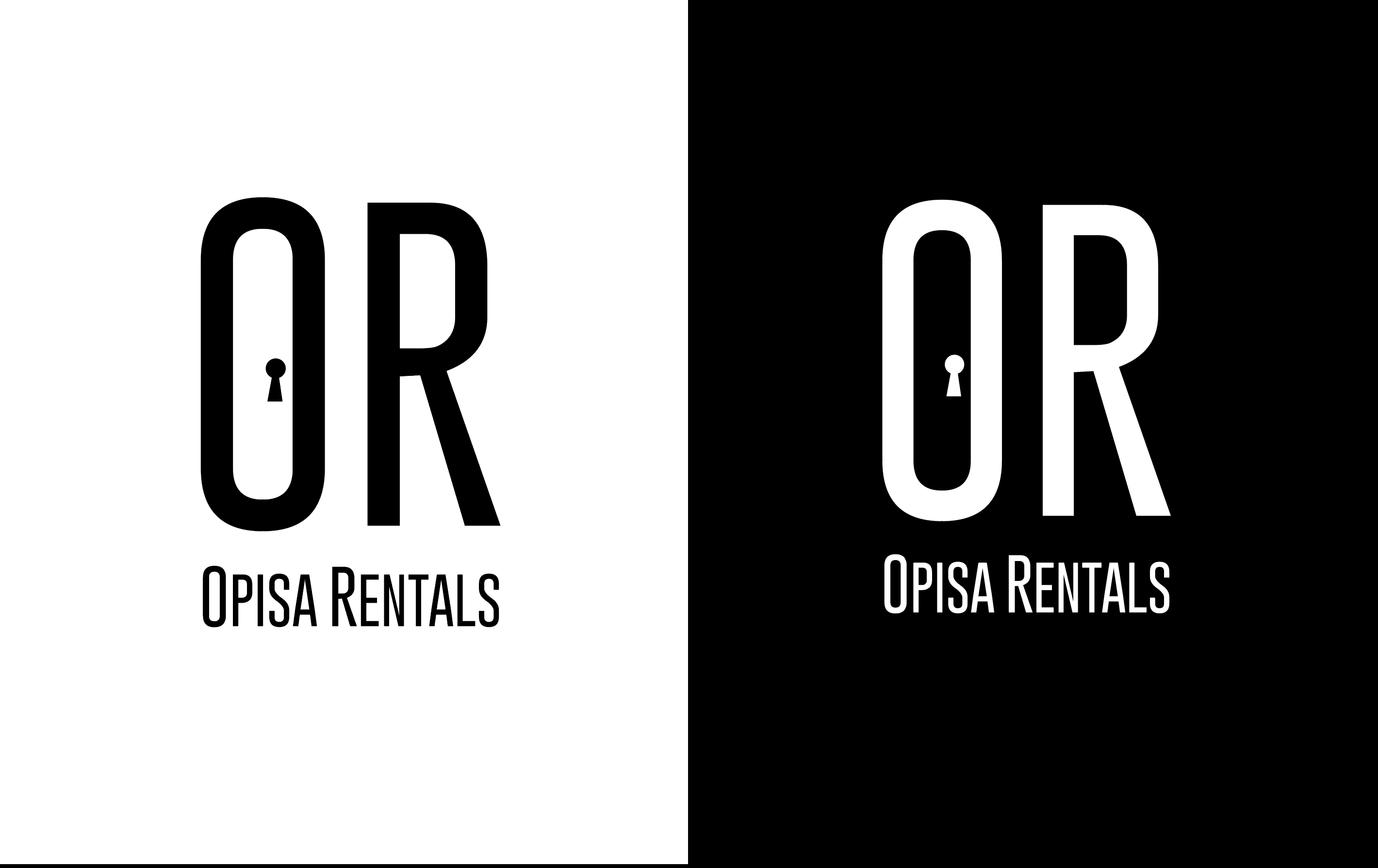
  3. 09

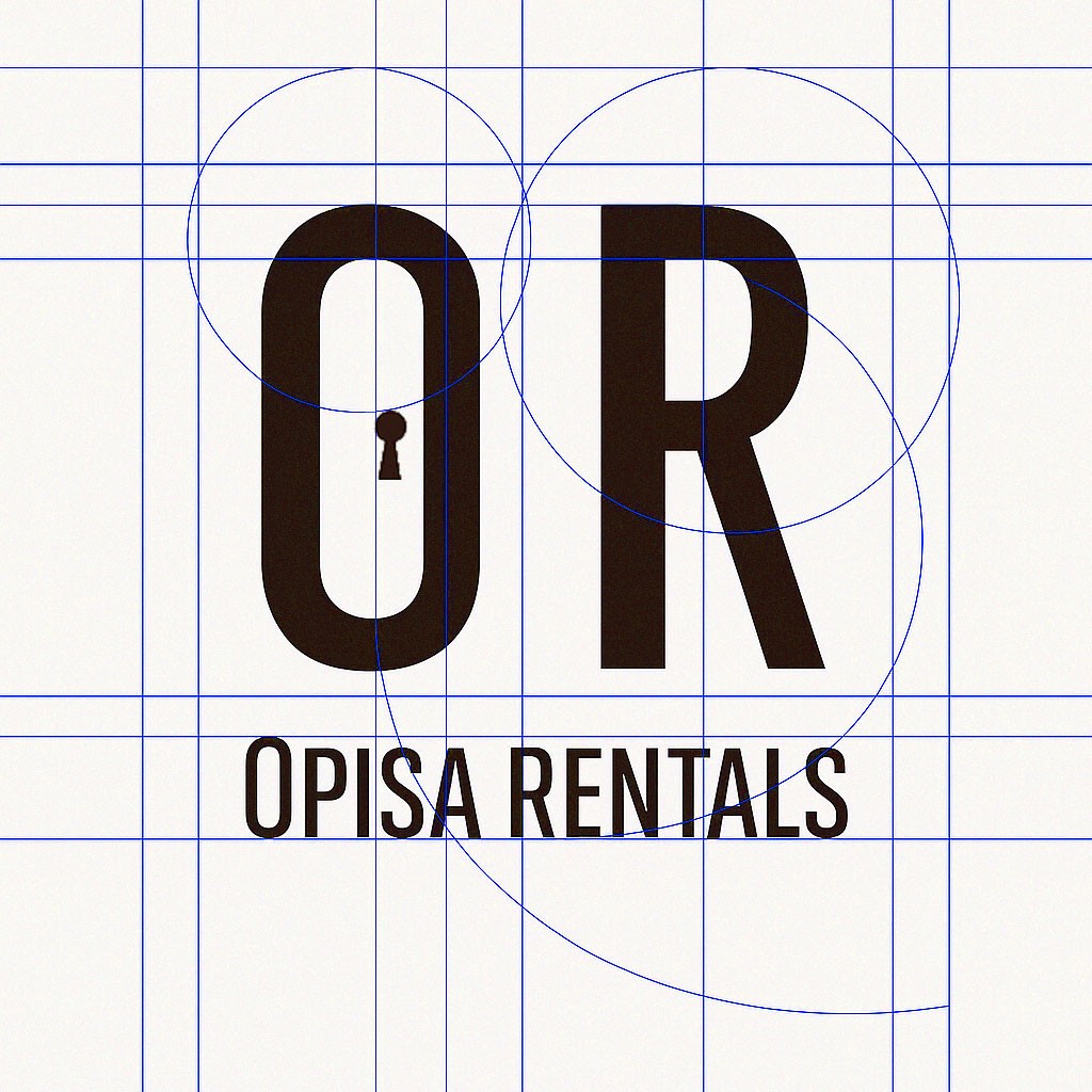
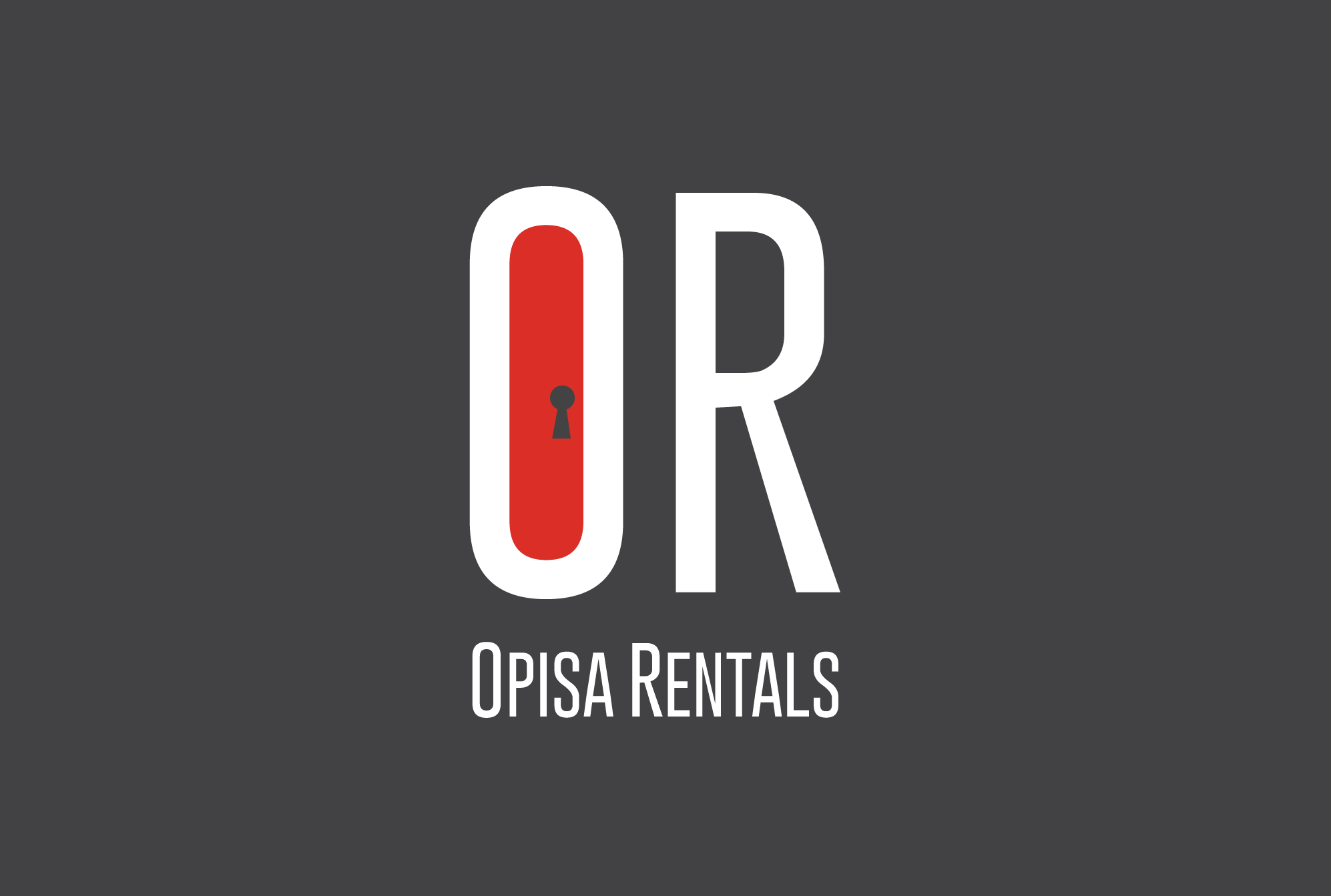
    Logo Design

    Designed proportional and balanced logo that hints the company’s mission while having an easily adapted design.
The Result

I believe

A brand is a living system.

Consistency is the foundation of trust.

Every element has a purpose.

Visual language unifies the message.

A strong logo anchors everything.

Typography carries the brand voice.

Color creates instant recognition.

A brand is felt before it is read.

Guidelines empower the whole team.

Scalability is built in from the start.

Identity is strategy made visible.

Systems outlast individual assets.