Brand Identity x real estate development.

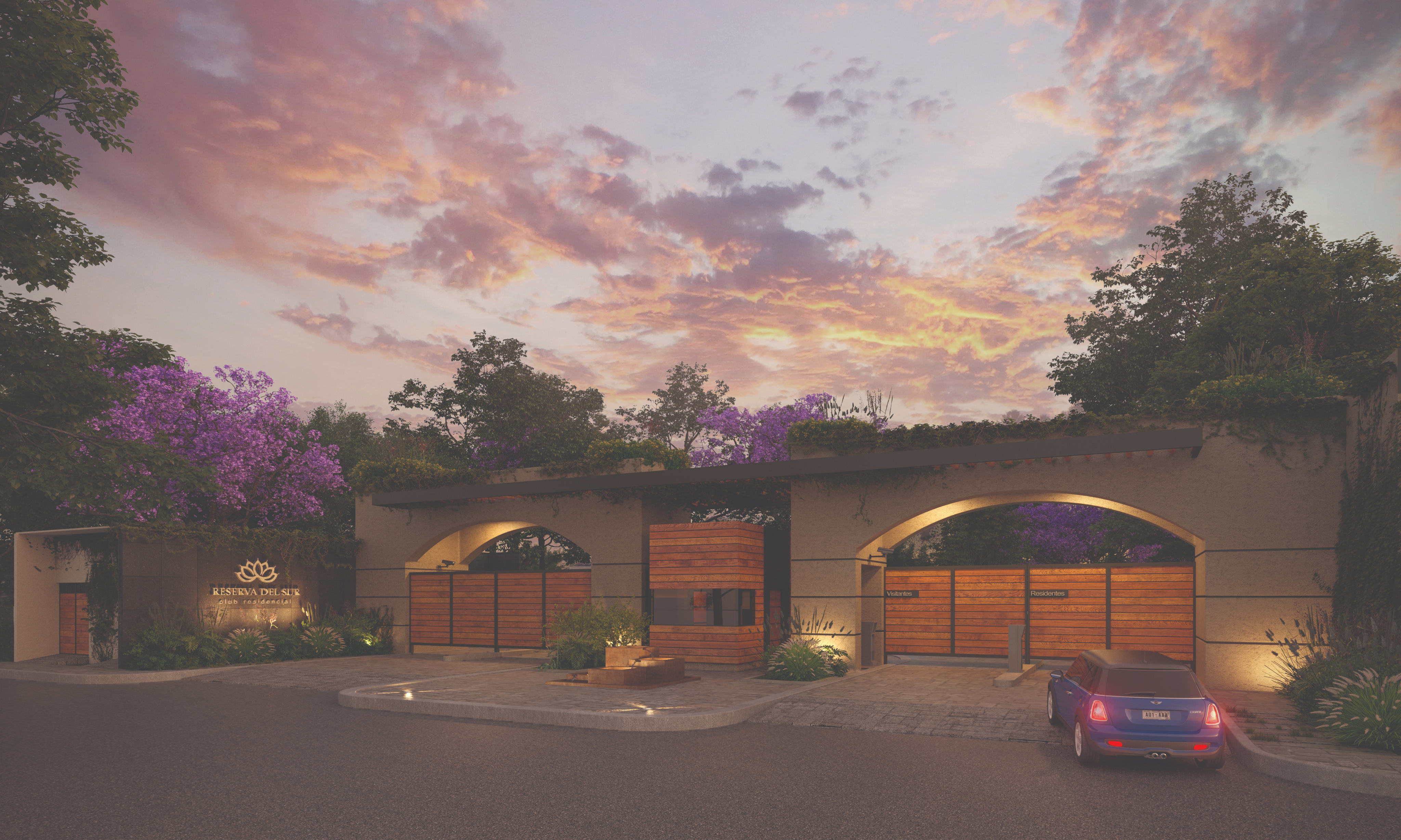
Created a brand identity for a residential complex; from naming strategy and concept exploration through logo system and pattern design.

Design makes a place feel like home.

A logo carries the brand's first promise.

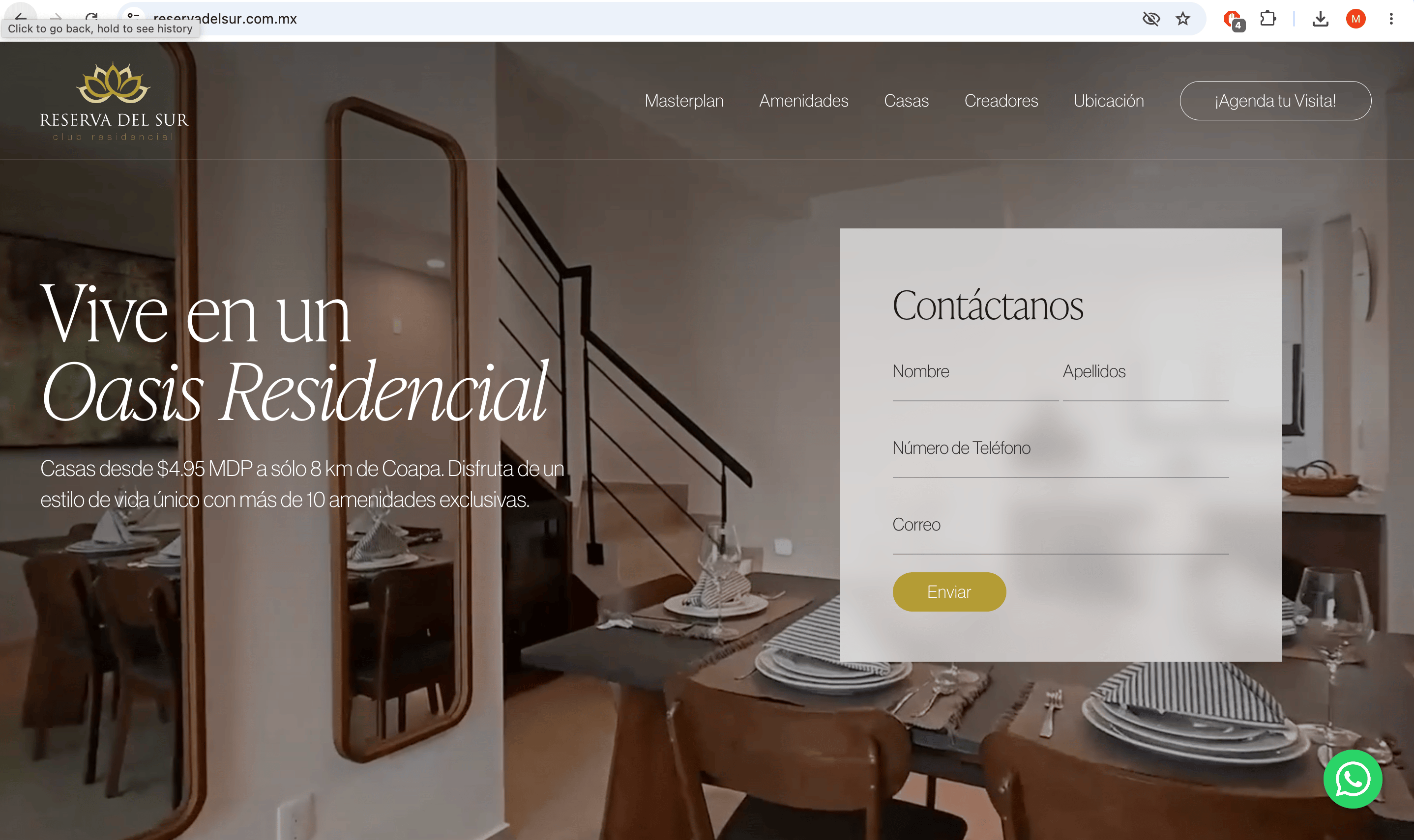
Every click is a brand moment.

Nature-inspired forms build trust.

Elegance communicates quality living.

Every curve was intentional.

Typography anchors the identity.

Color evokes calm and belonging.

Residential brands need warmth.

Identity design is emotional architecture.

Good logos feel inevitable.

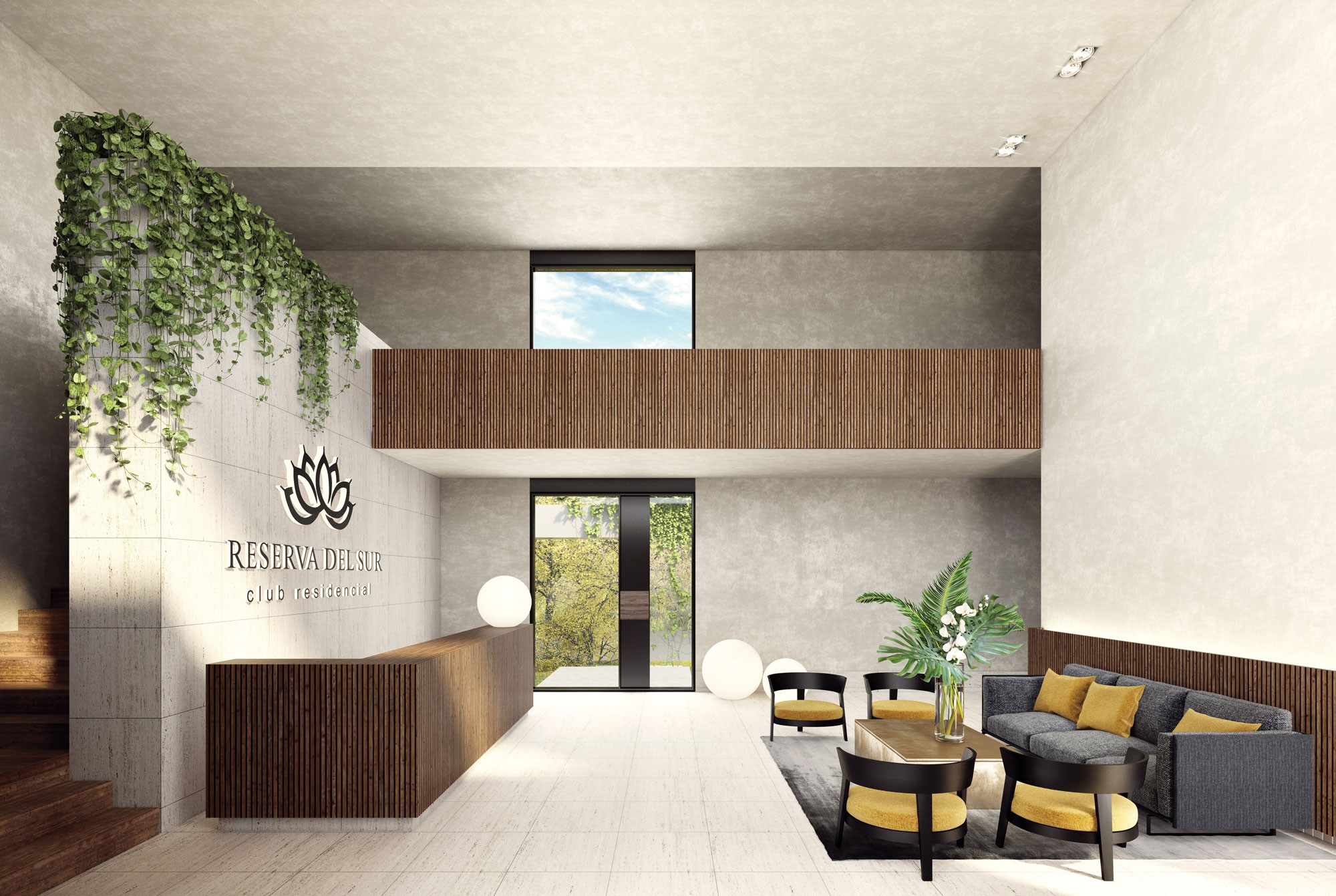
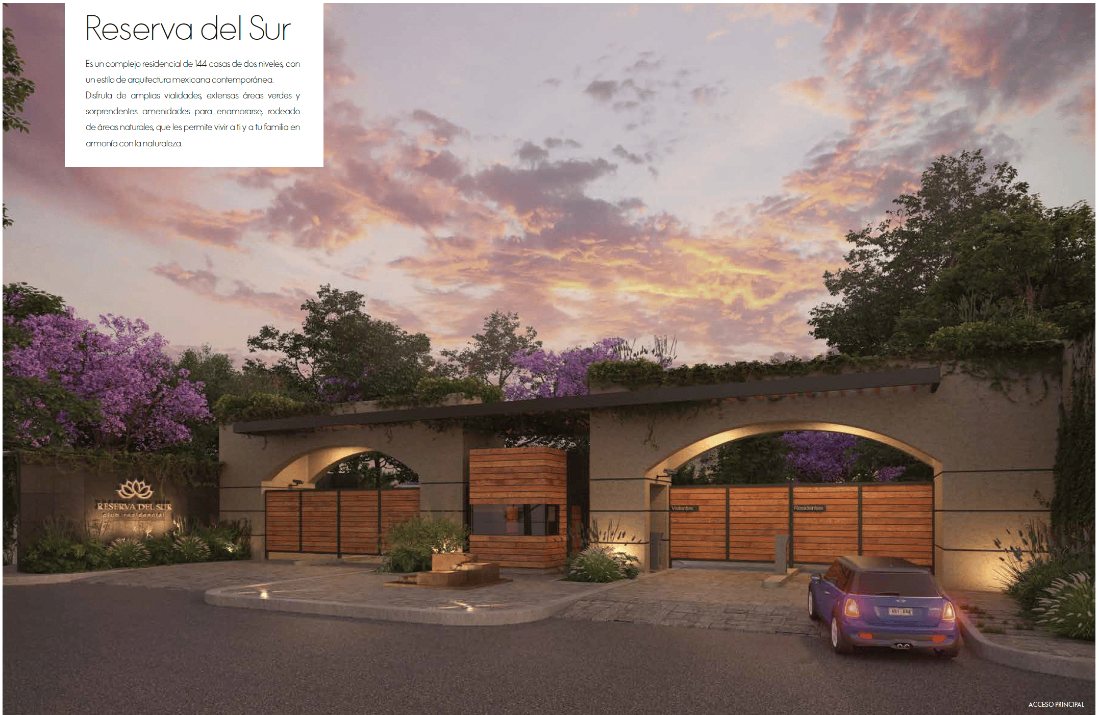
The brand lives beyond the screen.

plant
plant
red flower

Brief

Got the strategic positioning of the real estate development from the developers along with the user persona and bench mark.

white flower

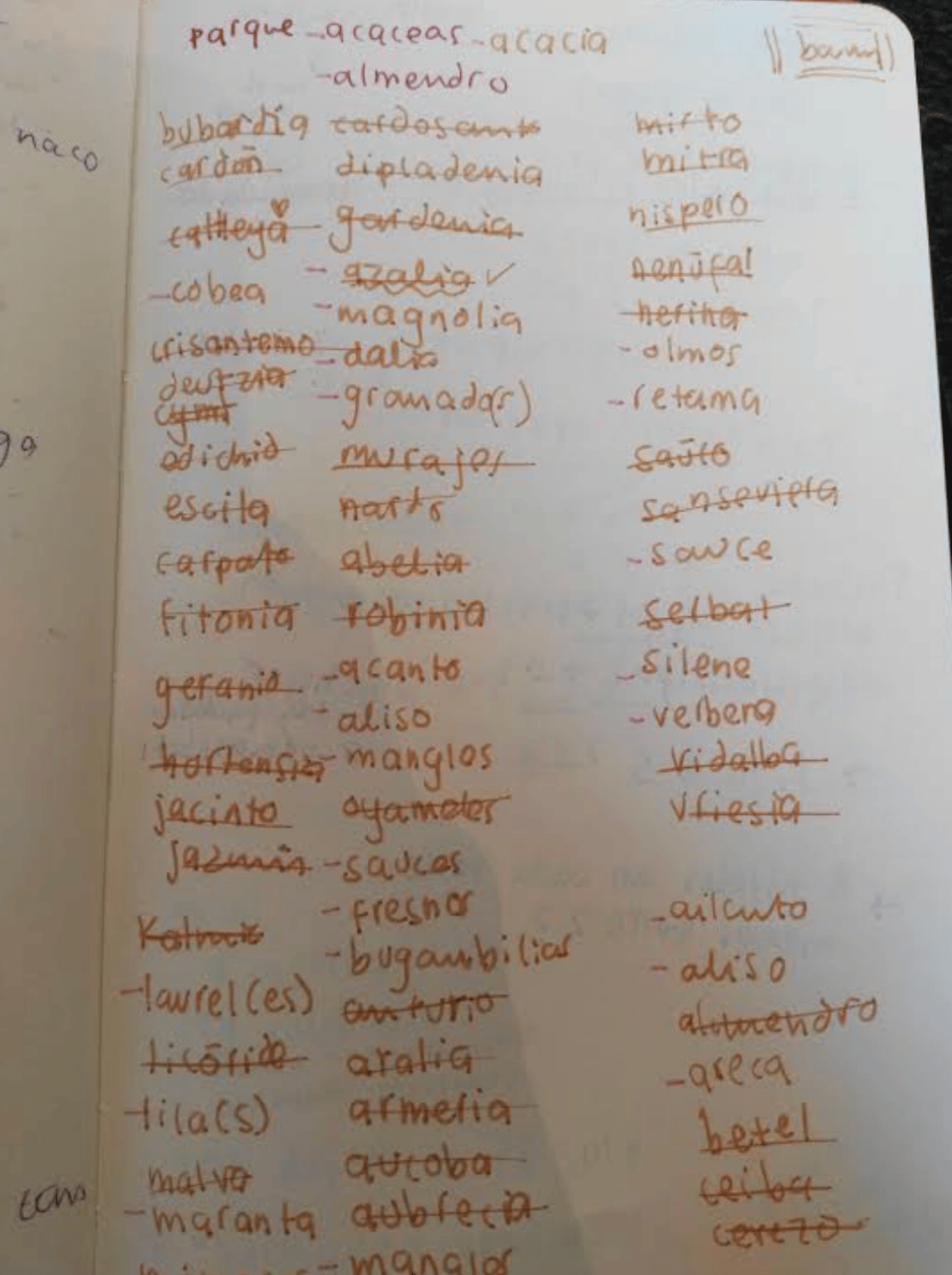
Naming Research

Researched naming concepts and references to identify directions that would align emotionally with the target audience.

white orchids

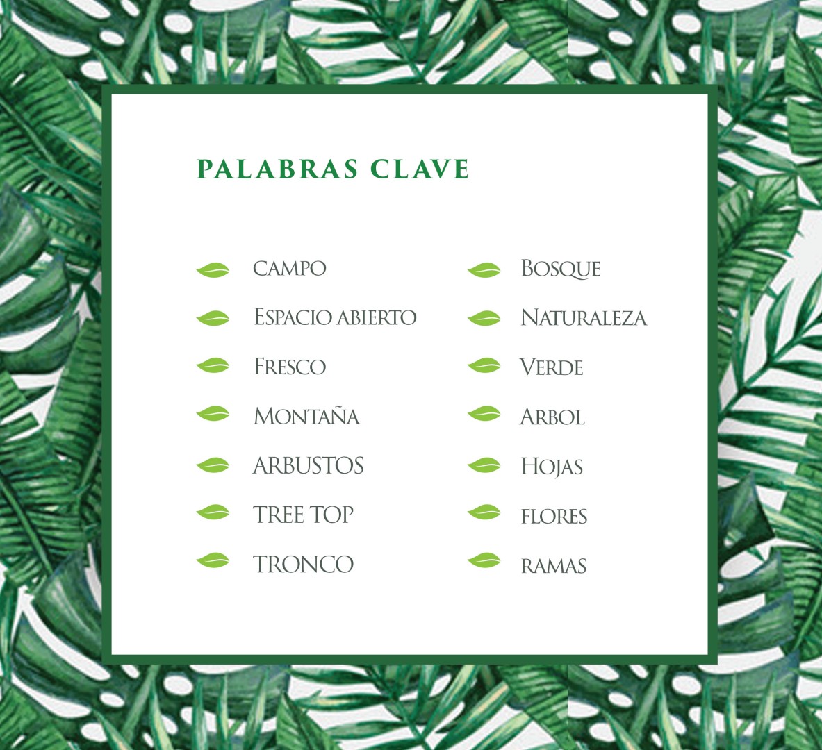
Brand Keywords

Used the core keywords to guide the visual and verbal decisions.

white flower

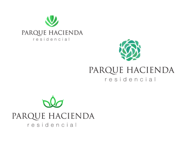
Initial Logo Concepts

Developed three initial graphic paths, each one interpreting the brand values through form and symbolic approach.

white orchids

Logo Variations

Explored the chosen graphic path and developed a full set of variations.

white flower

Logo

Delivered the final logo in a solid, neutral color; stripped of color decorative context.

red flower

Brand Pattern

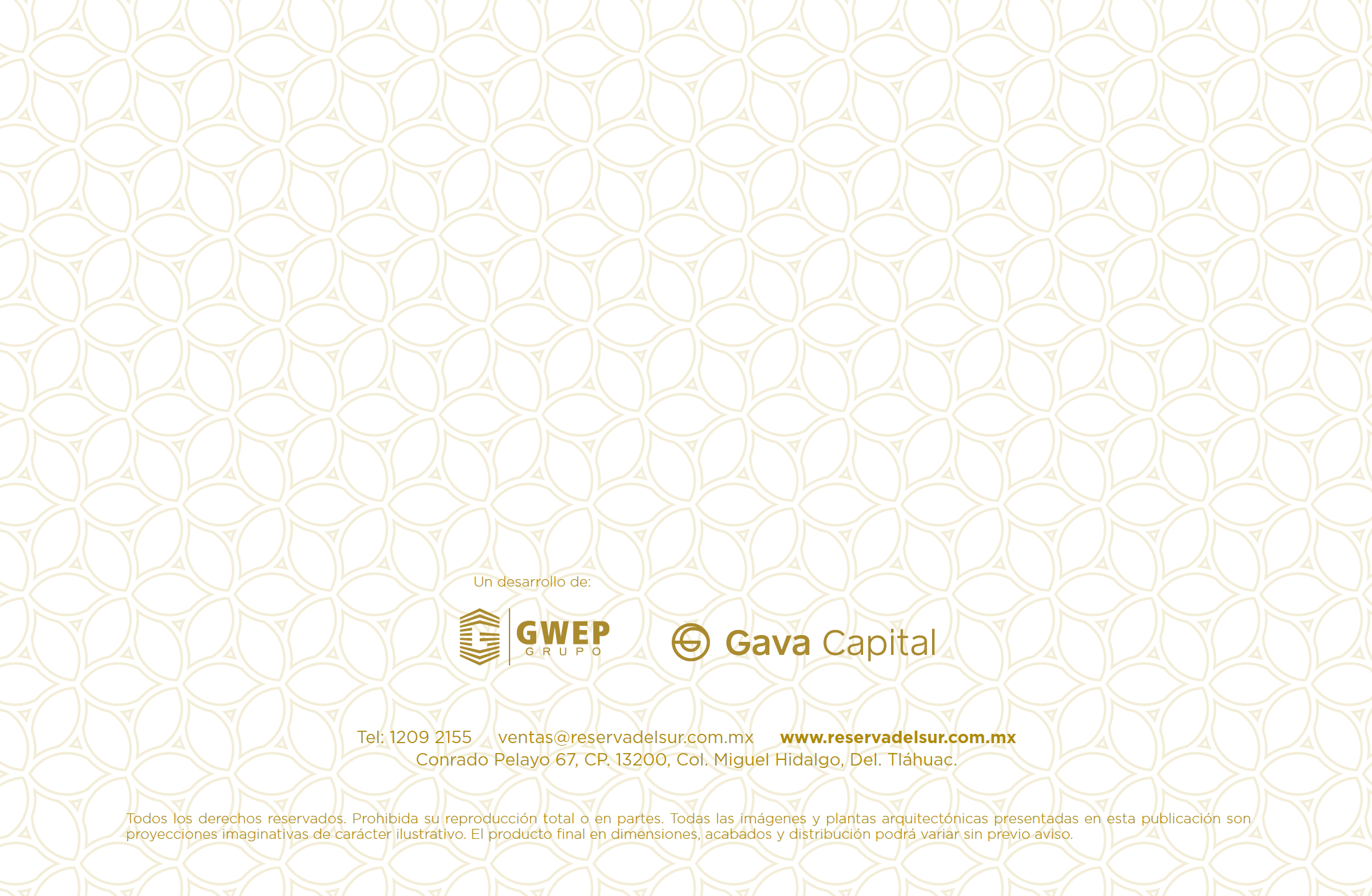
Developed a pattern from the logo mark, extending its visual identity into different possible applications.

Design Systems

Branding

UI/UX

Brand Identity x real estate development.

Created a brand identity for a residential complex; from naming strategy and concept exploration through logo system and pattern design.

Design makes a place feel like home.

A logo carries the brand's first promise.

Every click is a brand moment.

Nature-inspired forms build trust.

Elegance communicates quality living.

Every curve was intentional.

Typography anchors the identity.

Color evokes calm and belonging.

Residential brands need warmth.

Identity design is emotional architecture.

Good logos feel inevitable.

The brand lives beyond the screen.

plant
plant
red flower

Brief

Got the strategic positioning of the real estate development from the developers along with the user persona and bench mark.

Naming Research

Researched naming concepts and references to identify directions that would align emotionally with the target audience.

white flower
white orchids

Brand Keywords

Used the core keywords to guide the visual and verbal decisions.

Initial Logo Concepts

Developed three initial graphic paths, each one interpreting the brand values through form and symbolic approach.

white flower
white orchids

Logo Variations

Explored the chosen graphic path and developed a full set of variations.

Logo

Delivered the final logo in a solid, neutral color; stripped of color decorative context.

white flower
red flower

Brand Pattern

Developed a pattern from the logo mark, extending its visual identity into different possible applications.

Design Systems

Branding

UI/UX

Brand Identity x real estate development.

Created a brand identity for a residential complex; from naming strategy and concept exploration through logo system and pattern design.

Design makes a place feel like home.

A logo carries the brand's first promise.

Every click is a brand moment.

Nature-inspired forms build trust.

Elegance communicates quality living.

Every curve was intentional.

Typography anchors the identity.

Color evokes calm and belonging.

Residential brands need warmth.

Identity design is emotional architecture.

Good logos feel inevitable.

The brand lives beyond the screen.
plant
plant
  1. red flower

    Brief

    Got the strategic positioning of the real estate development from the developers along with the user persona and bench mark.
  2. Naming Research

    Researched naming concepts and references to identify directions that would align emotionally with the target audience.
    white flower
  3. white orchids

    Brand Keywords

    Used the core keywords to guide the visual and verbal decisions.
  1. Initial Logo Concepts

    Developed three initial graphic paths, each one interpreting the brand values through form and symbolic approach.
    white flower
  2. white orchids

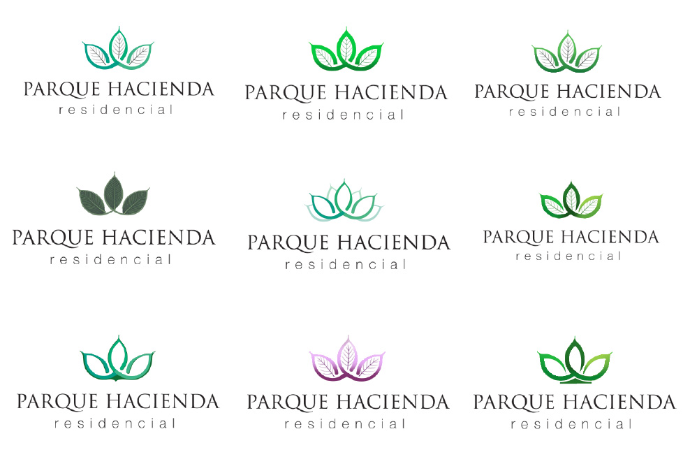
    Logo Variations

    Explored the chosen graphic path and developed a full set of variations.
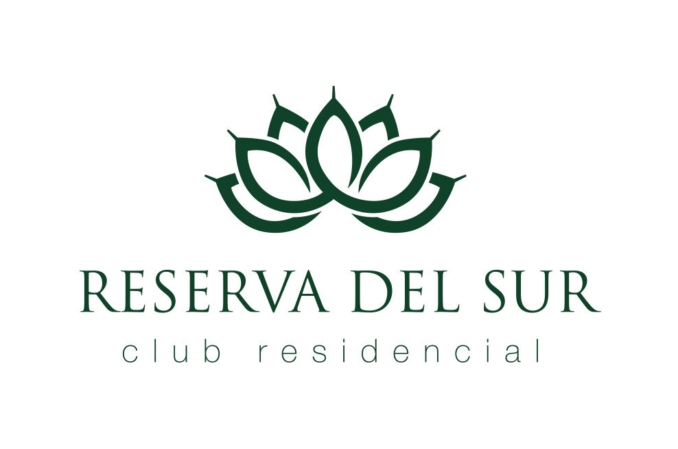
  1. Logo

    Delivered the final logo in a solid, neutral color; stripped of color decorative context.
    white flower
  1. red flower

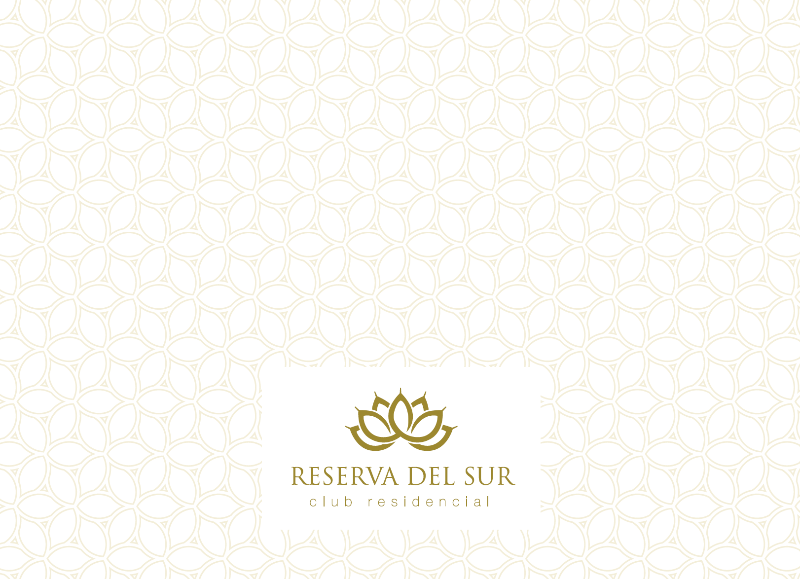
    Brand Pattern

    Developed a pattern from the logo mark, extending its visual identity into different possible applications.